
The rise of smartphones has prompted a critical shift towards responsive mobile design in web development. This approach ensures websites adapt seamlessly across various screen sizes, providing optimal user experiences on mobiles, tablets, and laptops. Key benefits include enhanced engagement through simplicity, improved SEO rankings, better accessibility, and cost-effective solutions for businesses. Tools like Google's Mobile-Friendly Test and integrated web design platforms simplify the process, while mobile-first strategies drive conversions, increase visibility, and cater to the dominant smartphone user base.
In today’s digital landscape, adopting a mobile-first design approach is no longer an option—it’s a necessity. With smartphones as the primary access point to the internet, prioritizing smaller screens and touch interfaces is crucial for ensuring accessibility and usability across all devices. This article explores the shift to responsive mobile design, its numerous benefits, key implementation strategies, and tools for optimization. We’ll delve into how this strategy enhances user experiences, improves SEO rankings, and offers cost-effective web design solutions.
- Understanding the Shift to Mobile-First Design
- Benefits of Responsive Mobile Design
- Key Elements of a Successful Mobile-First Strategy
- Tools for Assessing and Optimizing Mobile Usability
- The Impact on User Experience and Engagement
- SEO Advantages of Mobile Optimization
- Cost-Effectiveness in Web Design: Embracing Responsive Mobiles Solutions
Understanding the Shift to Mobile-First Design
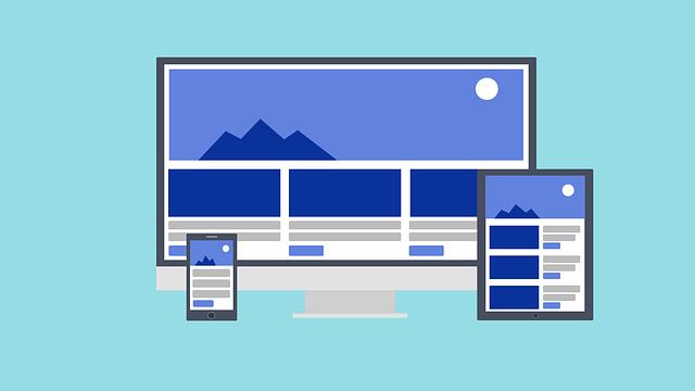
In recent years, there’s been a significant and continuous shift toward mobile-first design, driven largely by the increasing dominance of smartphones in our daily lives. With more people accessing the internet via their mobile devices than ever before, businesses and web designers are recognizing the necessity to prioritize mobile usability and accessibility. This paradigm shift from desktop-focused design to responsive mobile design ensures that websites adapt seamlessly to various screen sizes and types, providing an optimal viewing experience regardless of whether a user is on a smartphone, tablet, or laptop.
This new approach is not just about adaptability; it’s also about enhancing user engagement. Mobile-first designs focus on simplicity and intuitiveness, with larger touch targets and streamlined navigation menus tailored for the smaller screens of smartphones. By adopting these principles, businesses can create responsive web solutions that not only cater to a broader audience but also improve their search engine optimization (SEO). Search engines like Google actively favor mobile-friendly websites in their rankings, making it a strategic imperative for any business to invest in professional mobile site development and high-quality mobile web design.
Benefits of Responsive Mobile Design

The benefits of adopting a responsive mobile design extend far beyond just accommodating users with smaller screens. This approach ensures that your website’s layout, content, and functionality adapt seamlessly to any device, creating a unified user experience. Whether someone is browsing on their smartphone, tablet, or desktop computer, a responsive design means they’ll have equal access to all features without the need for clunky zooming or scrolling.
Additionally, a responsive mobile design significantly improves the performance of your website. By optimizing for mobile users, you reduce load times, which not only enhances user satisfaction but also signals to search engines that your site is efficient and worthy of higher rankings. This translates into better visibility online and increased traffic, especially from the growing number of mobile internet users. For businesses, particularly those focusing on e-commerce (Mobile Web Design for E-commerce) or seeking cost-effective web solutions (affordable web design), employing local mobile web designers to implement these strategies can unlock a wider audience and boost overall digital success through tailored, high-quality mobile web solutions.
Key Elements of a Successful Mobile-First Strategy

A successful mobile-first strategy revolves around several key elements. First and foremost, responsive mobile design is paramount. This means creating a website that fluidly adjusts its layout and functionality based on the device’s screen size, ensuring a seamless user experience across smartphones, tablets, and desktops. Custom Mobile-Friendly Websites tailored to these specific needs are essential, as one-size-fits-all approaches often fall short in meeting the unique requirements of mobile users.
Implementing intuitive navigation, larger touch targets for buttons and links, and streamlined menus that are easy to use with thumbs are additional crucial components. Engaging visual designs that work well on smaller screens, coupled with optimized content that loads quickly, contribute to higher user satisfaction. Local Mobile Web Designers or Expert Mobile Web Design professionals play a vital role in achieving these goals, offering specialized skills to create not just functional but also aesthetically pleasing mobile experiences that enhance brand visibility and drive conversions.
Tools for Assessing and Optimizing Mobile Usability
Assessing and optimizing mobile usability is made easier through various tools designed to help developers and designers. One such tool is Google’s Mobile-Friendly Test, which provides a quick and straightforward way to evaluate how well your website performs on mobile devices. This test offers insights into issues like page loading speed, content readability, and navigation ease, all vital aspects of a user-friendly mobile website.
Additionally, many web design platforms now incorporate responsive mobile design features, allowing for automatic adjustments to layouts and elements based on the device’s screen size. These tools simplify the process of creating a seamless mobile-first experience, ensuring that your website not only looks good but also functions optimally across a wide range of smartphones and tablets. By leveraging these resources, developers can efficiently refine their work, making mobile-friendly web design more accessible and cost-effective.
The Impact on User Experience and Engagement

A mobile-first design approach significantly enhances user experience and engagement by prioritizing smaller screens and touch interfaces. With a responsive mobile design, users can seamlessly access and navigate websites on their smartphones with minimal frustration. This means easier reading, intuitive interactions, and simpler menus that cater to the limitations of smaller screens. By focusing on these aspects, websites become more engaging and enjoyable to use, encouraging visitors to spend more time exploring the content and features offered.
Moreover, implementing a user-friendly mobile website design fosters higher levels of user satisfaction and loyalty. Since smartphones are often the primary device for internet access, ensuring that a website functions flawlessly on them is crucial. Affordable mobile web design services can provide cost-effective solutions without compromising quality. Ultimately, these practices not only improve user engagement but also positively impact SEO, making it easier for users to find and interact with the site through search engines like Google, which prioritize mobile-friendly content in their rankings.
SEO Advantages of Mobile Optimization

The rise of mobile internet usage has led to a significant shift in how users interact with websites, making mobile optimization crucial for any online presence. One of the most notable advantages is its positive impact on Search Engine Optimization (SEO). Google, for instance, has made it clear that responsive mobile design is a critical factor in determining website rankings. Websites that offer a seamless experience across mobile devices are more likely to rank higher in search results, which translates to increased visibility and organic traffic.
Full-Responsive Web Design ensures that your site adapts gracefully to different screen sizes and resolutions, providing an optimal viewing experience regardless of whether it’s a smartphone, tablet, or desktop. This approach not only enhances user satisfaction but also encourages longer browsing sessions, lower bounce rates, and better engagement metrics. For e-commerce businesses, Mobile Web Design for E-commerce becomes essential; it allows them to cater to the growing number of customers who prefer shopping via their smartphones, opening up new markets and revenue streams. Moreover, affordable mobile web design options ensure that even small businesses can compete effectively in the digital space without breaking the bank.
Cost-Effectiveness in Web Design: Embracing Responsive Mobiles Solutions

In today’s digital landscape, where smartphone usage dominates internet access, adopting a responsive mobile design is not just a best practice but an essential strategy for web designers and developers. Cost-effectiveness in web design is achieved through embracing responsive mobile solutions. By creating designs that adapt seamlessly to various screen sizes, developers can build a single website that caters to both mobile and larger device users. This approach streamlines the development process, reduces maintenance costs, and ensures a consistent user experience across platforms.
Instead of developing separate versions for desktops, tablets, and smartphones, a responsive adaptive web design allows for a unified front-end architecture. This means less code duplication, easier updates, and faster loading times on mobile devices. As a result, users are presented with user-friendly mobile websites that offer intuitive navigation, optimized content, and visually appealing layouts, regardless of the screen size they’re viewing on. Thus, responsive mobile design is a cost-efficient way to deliver high-quality experiences for all users while enhancing SEO rankings.