
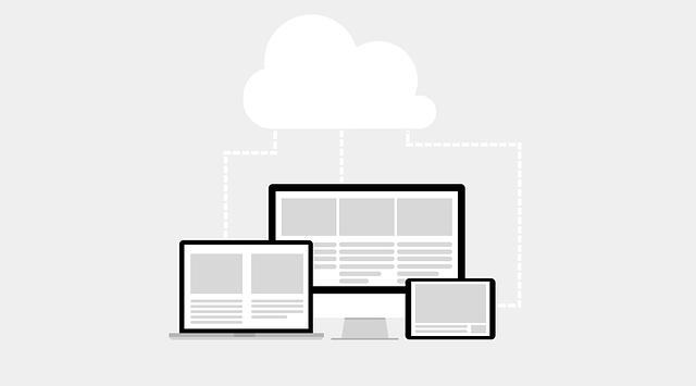
In an era dominated by smartphones, web design has evolved towards cross-device responsive design to cater to diverse users. This strategy ensures websites optimize for smaller screens while maintaining functionality across devices, enhancing user experience and accessibility. By simplifying content, prioritizing elements, and employing responsive typography, sites offer seamless navigation and improved SEO rankings. Local designers play a crucial role in crafting visually appealing, functional interfaces, saving costs and time compared to traditional desktop-focused methods. Tools like Google's Mobile-Friendly Test and Lighthouse aid in evaluating and refining mobile usability, ensuring high-quality user experiences across all devices.
In today’s digital era, where smartphones dominate internet access, adopting a mobile-first design approach is no longer an option but a necessity. This strategy ensures accessibility and usability across all devices, prioritizing the user experience on smaller screens. By creating responsive designs that adapt fluidly to different screen sizes, developers can make content easily readable and navigation intuitive for mobile users. A cross-device responsive design not only enhances user engagement and satisfaction but also positively impacts SEO, with search engines favoring mobile-friendly websites. This article explores the shift to mobile-first design, its benefits, content adaptation, navigation optimization, tools for assessment, and significant cost savings in web design.
- Understanding the Shift to Mobile-First Design
- Benefits of a Cross-Device Responsive Approach
- Adapting Content for Smaller Screens
- Optimizing Navigation and User Experience
- Tools for Assessing Mobile Usability
- Cost Savings in Web Design with Mobile First Strategy
Understanding the Shift to Mobile-First Design

In recent years, a significant shift has occurred in how users access and interact with websites—a paradigm change driven by the widespread adoption of smartphones. As smartphone ownership continues to grow globally, it’s becoming increasingly vital for businesses and web designers to embrace a mobile-first design philosophy. This approach ensures that digital experiences are optimized for smaller screens while still maintaining functionality across various devices.
Traditional website design often prioritized desktop or tablet usability, but with the rise of mobile internet usage, this strategy has become less effective. A cross-device responsive design, on the other hand, offers a seamless transition between different screen sizes and types. Local mobile web designers and professional mobile web design agencies are now at the forefront of creating these adaptable, user-friendly interfaces, ensuring that websites remain competitive in today’s digital landscape.
Benefits of a Cross-Device Responsive Approach

A cross-device responsive design approach offers numerous advantages for modern web development. By creating a single, adaptable design that caters to various devices, from smartphones to desktops, developers can significantly enhance user experience and accessibility. This strategy ensures that users across different platforms access the same high-quality content without compromising on functionality or visual appeal.
Implementing a cross-device responsive design not only provides a seamless user journey but also simplifies the development process. Instead of designing separate versions for each device type, developers can focus on creating one versatile layout, saving time and resources. This is especially beneficial for businesses aiming to offer Custom Mobile-Friendly Websites that cater to a local audience, as it ensures effective Mobile Web Optimization across all devices without requiring significant additional investment in hiring Local Mobile Web Designers.
Adapting Content for Smaller Screens
When adopting a mobile-first design approach, adapting content for smaller screens is crucial. This involves simplifying and condensing information to fit compact displays while maintaining readability. Essential elements are prioritized and presented in a hierarchical manner, ensuring users can quickly scan and understand key details. Images and multimedia content are optimized for mobile viewing, with appropriate file sizes and formats that prevent slow loading times. Additionally, using responsive typography allows text to resize dynamically based on the screen size, enhancing readability across devices.
A cross-device responsive design ensures that the website seamlessly transitions between various screen sizes without sacrificing functionality or aesthetics. This is achieved through flexible layouts, fluid grids, and media queries that detect and adjust content accordingly. As a result, users are presented with a user-friendly mobile website that offers a consistent experience, regardless of whether they’re on a smartphone, tablet, or desktop computer. By focusing on these mobile web solutions, businesses can cater to a broader audience, boosting user engagement and satisfaction while also improving their search engine optimization (SEO) rankings.
Optimizing Navigation and User Experience

In a mobile-first design approach, optimizing navigation and user experience involves creating intuitive and seamless interactions tailored for smaller screens. This means simplifying menus, ensuring quick loading times, and implementing easy-to-use search functions. By adopting a cross-device responsive design strategy, website owners can guarantee that users moving between devices—from smartphone to tablet or desktop—face no disruptions in their experience. For instance, a well-designed mobile site should allow users to effortlessly access key pages, fill out forms, and make purchases with just a few taps, mirroring the smooth navigation they’d expect on larger screens.
This optimization goes beyond just responsiveness, focusing on creating custom mobile-friendly websites that prioritize user needs. Local mobile web designers play a crucial role here, leveraging their expertise to craft interfaces that not only look good but also function flawlessly across various devices. By ensuring a mobile-friendly web design, businesses can attract and retain users, leading to higher engagement rates and ultimately improving their online presence and SEO rankings.
Tools for Assessing Mobile Usability

Assessing mobile usability is a critical step in achieving a seamless cross-device responsive design. Tools like Google’s Mobile-Friendly Test provide an easy, free way to evaluate how well your website performs on different mobile devices and browsers. This tool checks for issues like text that’s too small, difficult navigation, and slow page loading times—all common problems that can negatively impact user experience.
Beyond Google’s test, there are numerous other options available for both developers and non-technical users. Tools such as Lighthouse (an open-source, automated testing framework) offer in-depth performance analyses, including mobile-specific metrics like first input delay and cumulative layout shift. For startups looking to establish a solid Mobile Web Development foundation, these resources empower them to create not just responsive web design for startups, but also high-performing mobile site development that caters to a diverse audience across various devices.
Cost Savings in Web Design with Mobile First Strategy

Adopting a mobile-first strategy can significantly reduce web design costs while maintaining high-quality user experiences across all devices. Traditional web design often focuses on desktop interfaces, requiring separate designs for tablets and smartphones later in the process. This approach is not only time-consuming but also expensive due to the additional resources needed for creating and maintaining multiple versions of a website.
By prioritizing mobile usability first, designers can create a single, cross-device responsive design that seamlessly adapts to different screen sizes. This streamlined approach eliminates the need for costly revisions and ensures that startups and businesses alike can offer a professional mobile web design without breaking the bank. With mobile-first design, every element is optimized for smaller screens, from button sizes to menu layouts, resulting in a more intuitive and enjoyable user experience on any device.