
In web design, User Experience (UX) is crucial, focusing on intuitive navigation and functionality to boost engagement and conversions. A well-structured UX considers every interaction, from page load times to CTAs, resulting in seamless user journeys. Responsive layout ensures a unified experience across devices, with fluid grids and flexible media optimizing presentation without compromising aesthetics or functionality. Strategic navigational structures guide users effortlessly, while clear visual hierarchies direct attention to key elements, improving usability and engagement. Typography, whitespace, color, and contrast enhance visual appeal while maintaining accessibility. Continuous testing and iteration refine designs based on user feedback, ensuring exceptional UX and improved performance.
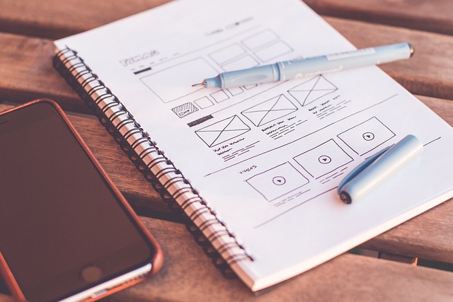
Website layout design is a critical aspect of web development, shaping user experiences and driving engagement. In today’s digital landscape, understanding User Experience (UX) is paramount. This article explores key elements that contribute to an effective website layout, from UX fundamentals to best practices in typography, visual hierarchy, and responsive design. Learn how to create intuitive navigation, enhance readability, and ensure accessibility through strategic color use, all while refining your web design through iterative testing.
Understanding User Experience (UX) and Its Impact on Layout
In the realm of web design, understanding User Experience (UX) is paramount. UX isn’t merely about aesthetics; it’s the art and science of creating digital environments that users find intuitive, enjoyable, and efficient to navigate. A well-designed UX translates into lower bounce rates, increased engagement, and higher conversion rates. It considers every interaction a user has with a website, from loading times to call-to-actions, ensuring a seamless flow that aligns with users’ goals and expectations.
The impact of UX on layout is profound. A thoughtful UX strategy guides the placement of elements on a web page, influencing everything from menu structures to button placements. By prioritizing user needs, designers can create layouts that not only look appealing but also function flawlessly across various devices and screen sizes. This responsiveness, driven by UX principles, ensures that websites provide consistent experiences, adapting gracefully to different viewing contexts—a key aspect in today’s mobile-first world of web design.
Key Elements of an Effective Website Layout
An effective website layout is a harmonious blend of aesthetics and functionality, designed to captivate users while achieving specific business goals. Core elements like navigation, content placement, and visual hierarchy play a crucial role in guiding users through the site seamlessly. Well-designed navigation menus, for instance, ensure visitors can effortlessly explore different sections, enhancing user experience (UX). Clear content organization, using headings, subheadings, and whitespace to separate information, makes it easier for users to scan and digest content quickly.
Visual cues, such as contrasting colors, images, and icons, further enrich the layout by drawing attention to important elements and calls-to-action (CTAs). These design choices not only make the site visually appealing but also guide users towards desired actions, whether it’s making a purchase, signing up for a newsletter, or contacting the business. Ultimately, an optimal web design layout balances these key elements to create a user-friendly interface that encourages engagement and drives conversions.
Responsive Design: Adapting to Various Screens

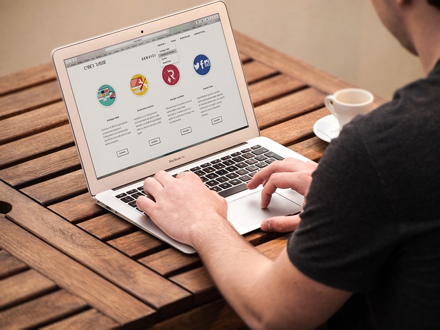
In modern times, responsive web design is an indispensable aspect of effective website layout. The primary goal is to create designs that adapt seamlessly to various devices and screen sizes, ensuring a consistent user experience across desktops, tablets, and smartphones. This approach involves using fluid grids, flexible images, and CSS media queries to optimize the layout for different platforms without sacrificing aesthetics or functionality.
By implementing responsive design, web designers can avoid the challenges posed by multiple layout versions tailored for specific devices. It streamlines development, improves user satisfaction, and enhances search engine optimization (SEO). With a responsive website, visitors enjoy seamless navigation and content consumption regardless of their preferred device, contributing to longer engagement times and better conversion rates in the world of web design.
Navigational Structures: Creating Intuitive Paths

In effective web design, navigational structures play a pivotal role in shaping user experiences. These structures act as roadmaps, guiding visitors through a website and influencing their ability to find desired content swiftly. A well-designed navigation system should create intuitive paths, ensuring that users can seamlessly traverse different pages without frustration or confusion. This is achieved through careful planning and organization of menu items, links, and breadcrumbs, allowing users to predict where they will land when clicking on a particular link.
By employing strategic design principles, web designers can simplify complex information architectures. This involves grouping related content, using clear labels, and maintaining a consistent layout across pages. Hierarchical structures, for instance, organize content from most important to least, making it easier for users to scan and locate specific information. Additionally, integrating intuitive search functions enhances navigation by offering an alternative path to discover content, catering to users who may not know the exact page or term they are looking for.
Visual Hierarchy: Guiding Users' Attention

In effective web design, establishing a clear visual hierarchy is paramount to guiding users’ attention and enhancing navigation. This involves organizing content and elements on a webpage in a logical and structured manner, ensuring that some information stands out while others remain supportive. Through strategic use of typography, color, size, and placement, designers can create a natural flow that directs users’ eyes towards the most important parts of the page first. For instance, larger headlines, bold subheadings, and contrasting colors can all work together to establish a hierarchy that makes it easy for visitors to understand the content structure and find what they’re looking for quickly.
A well-designed visual hierarchy not only improves usability but also boosts user engagement. By directing users’ attention to key calls-to-action (CTAs) or essential information, websites can increase conversions, reduce bounce rates, and improve overall visitor satisfaction. In web design, the goal is to create a seamless experience where users feel guided rather than overwhelmed, ensuring that every element on the page serves a purpose in leading them through a logical and engaging journey.
Best Practices for Typography in Web Design

In Web Design, typography plays a pivotal role in user experience and overall aesthetics. The best practices for typography focus on readability and hierarchy. Selecting fonts that complement each other and ensuring consistent sizes, weights, and styles across the website is essential. For instance, using a clear and readable font like Arial or Helvetica for body text, while reserving more decorative fonts for headings, subheadings, or calls to action, helps users navigate effortlessly. Line height, letter spacing, and word spacing should be adjusted to avoid clutter and enhance readability on both desktop and mobile devices.
Additionally, considering color contrast between text and background is crucial for accessibility. Using tools like the Web Content Accessibility Guidelines (WCAG) can help designers ensure their typography meets accessibility standards. Proper use of capitalization, whitespace, and alignment further enhances readability. By adhering to these practices, Web Design professionals can create visually appealing and user-friendly interfaces that engage visitors and convey information effectively.
Incorporating White Space for Enhanced Readability

In the realm of web design, creating a visually appealing and user-friendly layout involves more than just packing as much content as possible onto a page. One often overlooked yet powerful tool in a designer’s arsenal is white space—the empty areas around text, images, and other elements on a webpage. Incorporating strategic white space can significantly enhance readability, making the overall design more inviting and accessible to users.
By allowing certain parts of a web page to “breathe,” white space guides users’ eyes naturally through the content, reducing visual clutter. This is especially crucial in today’s digital era where users often scan websites quickly, seeking information at a glance. Well-placed white space can highlight important elements, such as headings and calls to action, making them stand out and ensuring they capture the attention of visitors. Thus, it plays a pivotal role in creating a harmonious web design that not only looks stunning but also facilitates seamless user navigation.
Using Color and Contrast for Visual Appeal and Accessibility

In web design, color and contrast play a dual role in creating both visual appeal and ensuring accessibility for all users. Strategic use of colors can instantly draw attention to key elements on a webpage, guiding users’ eyes naturally through the layout. Warmer tones often evoke a sense of inviting comfort, while cooler hues can convey professionalism or tranquility, depending on the brand’s identity and target audience.
Contrast, on the other hand, is vital for readability. High-contrast combinations make text and interactive elements more noticeable, especially for users with visual impairments or color blindness. Web designers should follow accessibility guidelines to ensure that text stands out against its background, facilitating easier navigation and a more inclusive user experience. Balancing aesthetic appeal with accessibility standards is crucial in modern web design practices.
Testing and Iterating: Refining the Layout
In the realm of web design, testing and iterating are fundamental stages in refining a website layout. Once the initial design is created, it’s crucial to gather feedback from a diverse set of users to understand their navigation preferences and visual perceptions. This user-centric approach ensures that the layout meets the needs and expectations of your target audience.
Through A/B testing, heatmap analysis, and user feedback, designers can identify pain points, such as cluttered menus or poorly positioned call-to-actions. By making data-driven adjustments based on these insights, web design professionals can continuously enhance the layout, leading to improved user engagement and conversion rates. This iterative process is what turns a good design into an exceptional one, ultimately elevating the overall web design experience.