
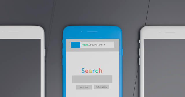
In recent years, a significant shift in internet usage driven by smartphone adoption has prompted designers and developers to prioritize fluid responsive mobile design. This ensures websites adapt seamlessly to different screen sizes and resolutions, providing an optimal viewing experience. Benefits include reaching a broader audience, cost savings, improved SEO rankings, enhanced user satisfaction through intuitive navigation, and easily readable content. By adapting content for smaller screens, streamlining touch interactions, and using tools like Google's Mobile-Friendly Test, businesses can create high-converting mobile experiences that boost sales and customer satisfaction.
In today’s digital landscape, adopting a mobile-first design approach is no longer an option but a necessity. As smartphones dominate as the primary access point to the internet, prioritizing mobile usability ensures your website resonates with a vast audience. This strategy involves creating fluid responsive mobile designs that seamlessly adapt to various screen sizes, offering a seamless experience on smaller screens. By focusing on touch interfaces and optimizing content for readability, navigation becomes intuitive.
This article explores the shift to mobile-first design, its numerous benefits, including enhanced user engagement and improved SEO rankings. We’ll guide you through implementing fluid responsive mobile design, adapting content, optimizing navigation, assessing usability, and the significant cost savings associated with this approach.
- Understanding the Shift to Mobile-First Design
- Benefits of Fluid Responsive Mobile Design
- Adapting Content for Smaller Screens
- Optimizing Navigation for Touch Interfaces
- Assessing and Improving Mobile Usability
- Cost Savings through Mobile-Centric Web Development
Understanding the Shift to Mobile-First Design

In recent years, a significant shift has occurred in how users interact with the internet—a paradigm change driven primarily by the widespread adoption of smartphones. With an ever-growing number of people relying on their mobile devices as their primary gateway to the web, designers and developers are increasingly prioritizing fluid responsive mobile design. This approach ensures that websites seamlessly adapt to various screen sizes and resolutions, providing an optimal viewing experience regardless of whether a user is on a state-of-the-art smartphone or an older tablet.
The benefits of this mobile web optimization strategy extend far beyond just accommodating a broader audience. Implementing responsive website design allows for more efficient Mobile Web Solutions, streamlining the development process and reducing costs. Moreover, it enhances user satisfaction by offering intuitive navigation and easily readable content, which is crucial for maintaining engagement on what has become the go-to platform for internet access.
Benefits of Fluid Responsive Mobile Design

Adopting a fluid responsive mobile design offers numerous advantages for businesses aiming to create seamless user experiences across diverse devices. This approach ensures that websites adapt gracefully to various screen sizes, from smartphones to tablets and desktops, providing an optimal viewing experience regardless of the platform. By prioritizing mobile users, businesses can cater to a wider audience, as the majority of internet access is now through mobile devices.
Furthermore, responsive web solutions for businesses are cost-effective strategies to enhance online visibility. SEO-friendly mobile websites that employ fluid responsive design are favored by search engines like Google, improving search rankings and driving more organic traffic. With affordable mobile web design, businesses can ensure their digital presence is accessible, visually appealing, and consistent across all devices without breaking the bank.
Adapting Content for Smaller Screens

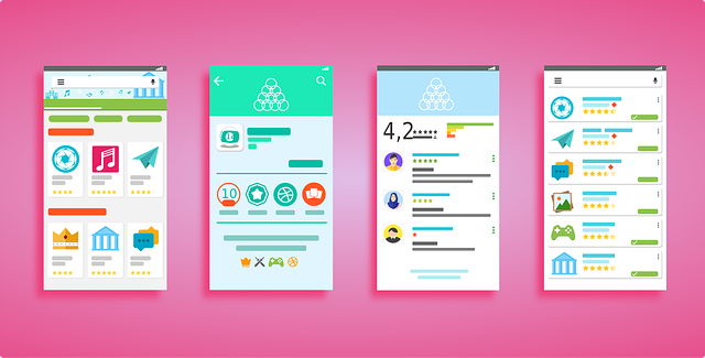
When adopting a mobile-first design approach, content adaptation is a key consideration. Websites must be optimized to display and function seamlessly on smaller screens while maintaining readability and usability. This involves condensing text, utilizing larger font sizes, and simplifying complex information into easily digestible chunks. Images and graphics are also adjusted to fit the reduced screen space, often requiring a more minimalist approach. Expert Mobile Web Design specialists understand that content should be presented in a logical, hierarchical manner, ensuring users can quickly find what they need without scrolling excessively or struggling to interact with elements.
For e-commerce platforms, this translates into creating intuitive shopping experiences on mobile devices. Mobile Web Design for E-commerce focuses on streamlining product browsing, simplifying checkout processes, and enhancing visual presentation to cater to the unique constraints of smaller screens. Local Mobile Web Designers play a vital role in ensuring these adaptations are executed flawlessly, resulting in high-converting mobile experiences that boost sales and customer satisfaction. Through fluid responsive mobile design, businesses can reach a broader audience, from smartphone users on the go to those with tablets, creating a consistent and engaging user journey across all devices.
Optimizing Navigation for Touch Interfaces
Designing for touch interfaces is a key aspect of mobile-first web design. With smartphones’ larger screens and touch capabilities, creating intuitive navigation that works seamlessly with a user’s fingers is essential. This involves simplifying menu structures, ensuring buttons are large enough for easy tapping, and implementing gestures like swiping and pinching to navigate through content. A fluid responsive mobile design adapts not just to different screen sizes but also to the unique interactions users have with their devices.
Mobile web development experts prioritize these touch-based considerations to create user-friendly mobile websites. By focusing on a mobile-first approach, developers can guarantee that the website’s navigation and overall usability are optimized for smaller screens from the outset. This strategy ensures a consistent experience across various devices, promoting user satisfaction and engagement while also benefiting search engine optimization (SEO) due to Google’s preference for mobile-friendly sites.
Assessing and Improving Mobile Usability
Assessing mobile usability is a critical step in optimizing your website for smaller screens. Tools like Google’s Mobile-Friendly Test offer insights into how well your site functions on smartphones, identifying issues with content readability, navigation, and even page loading times. Once these areas are pinpointed, developers can work on improving the overall user experience through various strategies. This may involve simplifying complex layouts, ensuring touch-friendly controls, and implementing a fluid responsive mobile design that adapts seamlessly to different screen dimensions.
Responsive Web Solutions for Businesses can significantly enhance user engagement by creating custom mobile-friendly websites tailored to each brand’s unique requirements. By focusing on clear calls to action, intuitive navigation menus, and high-quality visuals optimized for smaller screens, these Custom Mobile-Friendly Websites ensure a seamless experience across all devices. This approach not only benefits users but also boosts SEO rankings, making your business more visible to mobile searchers.
Cost Savings through Mobile-Centric Web Development

Adopting a mobile-centric approach to web development offers significant cost savings for businesses aiming to create affordable mobile web solutions. By prioritizing fluid responsive mobile design, developers can build websites that adapt seamlessly to various screen sizes and resolutions, eliminating the need for separate versions tailored for smartphones, tablets, and desktops. This streamlined process reduces development time and resources, making it an economical choice for startups and small businesses with limited budgets.
Furthermore, a mobile-first strategy ensures that any subsequent adjustments for larger screens are more straightforward and less resource-intensive. This approach allows designers to create custom mobile-friendly websites that not only look great but also function flawlessly across all devices, ultimately leading to higher user satisfaction and engagement.