
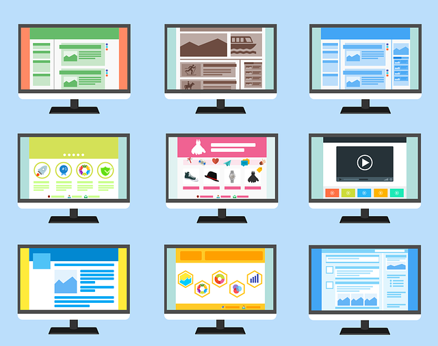
Responsive Web Design (RWD) is an essential approach that enables websites and web applications to adapt seamlessly across diverse devices, from desktops to mobile phones, offering enhanced user experiences. By utilizing flexible layouts, optimized images, and CSS media queries, RWD ensures content reconfigures dynamically based on screen size and orientation. This not only boosts user satisfaction and SEO rankings but also improves functionality, accessibility, and page performance, leading to faster load times, reduced bounce rates, and increased conversion rates. A comprehensive RWD strategy involves semantic HTML5, structured data, fluid layouts, optimization techniques, and intuitive navigation, ultimately fostering engagement and loyalty in the digital landscape.
In today’s digital era, a robust online presence is non-negotiable for businesses. Full-Service Responsive Web Design isn’t just a trend; it’s an essential strategy for reaching and engaging diverse users across various devices. This comprehensive guide explores the fundamentals of responsive design, its significant impact on modern businesses, and offers insights into key components, user experience optimization, visual appeal, performance, SEO, and successful implementation through real-world case studies.
Understanding Responsive Web Design: The Basics

Responsive Web Design is an approach that ensures websites and web applications adapt and display optimally across various devices, from desktops to tablets and mobile phones. This concept has become essential as users increasingly access online content through different screens and platforms. The basic idea revolves around using flexible layouts, images, and CSS media queries to change the presentation of a site based on the user’s screen size and orientation.
By employing responsive techniques, designers can create fluid and dynamic pages that reconfigure seamlessly, providing an optimal viewing experience regardless of the device used. This not only enhances user satisfaction but also improves search engine optimization (SEO) rankings, as Google and other major search engines prioritize mobile-friendly websites in their results.
Why Is Responsive Design Crucial for Modern Businesses?

In today’s digital era, having a strong online presence is no longer an option but a necessity for modern businesses. With a vast majority of customers turning to their smartphones and tablets for information and transactions, a responsive web design has become crucial. It ensures that a website seamlessly adapts to different screen sizes and resolutions, providing an optimal user experience regardless of the device being used.
Responsive Web Design (RWD) is not just about making a website look good on various devices; it’s about enhancing functionality, accessibility, and search engine optimization (SEO). A responsive site loads faster, reduces bounce rates, and improves conversion rates, all of which contribute to better business outcomes. RWD also allows businesses to reach a wider audience, including those who prefer mobile browsing, thereby increasing their market potential.
Key Components of a Full-Service Responsive Strategy

A full-service responsive web design strategy encompasses several critical components that work together to deliver an exceptional user experience across all devices and screen sizes. Firstly, a robust content strategy is essential, focusing on creating flexible and adaptable content that seamlessly resizes and reorganizes based on the viewing context. This involves utilizing semantic HTML5 markup and structured data to ensure search engines can easily interpret and display information accurately.
Moreover, fluid and adaptive layouts are pivotal. Designers employ media queries and flexible grid systems to build dynamic layouts that adjust gracefully as users switch between desktops, tablets, and smartphones. Additionally, optimizing images, scripts, and stylesheets for efficient loading is crucial to ensuring fast page performance, enhancing user satisfaction, and contributing to search engine rankings through improved metrics like bounce rate and time on site.
User Experience: Optimizing for All Screens

In the realm of Responsive Web Design, prioritizing user experience (UX) is paramount. The primary goal is to optimize websites for all screens, from desktops to tablets and smartphones. This holistic approach ensures that users across diverse devices enjoy a seamless and consistent browsing journey. By implementing responsive design strategies, web developers create flexible layouts, images, and content that adapt gracefully to various screen sizes, ensuring optimal visibility and ease of interaction.
A well-executed Responsive Web Design considers not just the technical aspects but also the human factor. It focuses on intuitive navigation, quick loading times, and accessible interfaces, ultimately enhancing user satisfaction. This is crucial in today’s digital landscape where users expect instant gratification, regardless of their preferred device. Thus, a UX-focused responsive design serves as a competitive advantage, fostering engagement and loyalty among visitors.
Best Practices for Creating Visually Appealing Responsive Sites

Creating visually appealing responsive websites involves a blend of design aesthetics and technical expertise. Best practices include ensuring Responsive Web Design that adapts seamlessly to various screen sizes and devices, from desktops to smartphones. Utilize flexible layouts with CSS media queries to adjust content placement and styling based on screen dimensions.
Visual appeal stems from clean, uncluttered designs, consistent branding elements, and effective use of whitespace. High-quality images and typography that scale well across devices are essential. Consider color palettes and contrast ratios for readability on different backgrounds. User experience should be prioritized with intuitive navigation, clear call-to-actions, and fast loading times to keep visitors engaged and satisfied.
Performance and SEO: Enhancing Search Engine Rankings

In the realm of digital marketing, performance and SEO (Search Engine Optimization) are paramount for online success. A full-service responsive web design plays a pivotal role in achieving both. Responsive design ensures your website adapts seamlessly to various devices, be it a desktop computer or a smartphone, enhancing user experience and reducing bounce rates. This adaptability signals to search engines like Google that your site is user-friendly, mobile-responsive, and worth ranking higher.
Moreover, responsive web design directly contributes to better SEO rankings. Search engines favor websites with faster loading times, and a well-designed responsive site ensures optimal page speeds across all devices. Additionally, by creating a single, unified website for all users, you avoid the complexities of maintaining multiple, separate sites tailored for different screen sizes. This streamlined approach allows search engine crawlers to index your content more efficiently, leading to improved visibility and higher rankings in search results.
Tools and Technologies for Efficient Development
In the realm of Responsive Web Design, developers have at their disposal a myriad of tools and technologies that streamline the development process and ensure optimal user experiences across various devices. One of the most popular tools is Bootstrap, a robust CSS framework that offers predefined styles and layouts, making it easier to create responsive designs with minimal coding. Additionally, JavaScript libraries like jQuery simplify the manipulation of HTML and CSS, enabling dynamic content loading and smooth transitions.
For efficient development, designers often turn to version control systems such as Git, which facilitate collaboration and allow for easy tracking of changes. Integrated Development Environments (IDEs) like Visual Studio Code or WebStorm provide a host of features including code autocompletion, debugging tools, and real-time performance monitoring, enhancing productivity and ensuring high-quality outcomes. These technologies collectively contribute to the creation of not just functional, but also aesthetically pleasing responsive websites.
Case Studies: Real-World Examples of Successful Implementation

In the realm of Responsive Web Design (RWD), case studies serve as vibrant examples of successful implementations that underscore its importance in today’s digital landscape. These real-world scenarios showcase how businesses have transformed their online presence by adopting RWD principles, resulting in enhanced user experiences across various devices. For instance, a recent study highlighted a retail brand’s metamorphosis, where a once labyrinthine website was redesigned to offer a seamless shopping experience on desktops, tablets, and smartphones. This case demonstrates the power of responsive design in fostering customer engagement and increasing conversions.
Another compelling example involves a media company that utilized RWD to create a dynamic, multi-faceted platform. By implementing a flexible layout and adaptive images, they ensured that their content remained legible and engaging on different screen sizes. This approach not only attracted more visitors but also improved user satisfaction, as evidenced by increased time spent on the site and reduced bounce rates. These success stories not only validate the effectiveness of Responsive Web Design but also serve as blueprints for other organizations looking to enhance their online presence in a competitive digital market.