
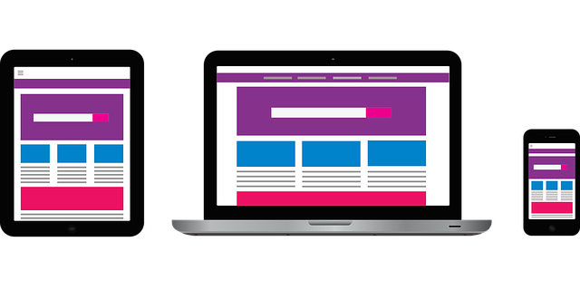
The widespread adoption of smartphones has led to a dramatic shift in how people access the internet, with mobile devices now the primary source of online content. In response, traditional web design has evolved into mobile-first and responsive web design approaches, ensuring websites are optimized for diverse screensizes and devices. This strategy keeps websites competitive, enhances user engagement, and drives higher conversion rates. Key elements include flexible layouts, fast loading times, mobile-optimized content, and clear call-to-actions. Tools like Bootstrap, React, and Vue.js streamline the creation of responsive websites. Avoiding common pitfalls like replicating desktop experiences and neglecting content readability on smaller screens is crucial. Measuring success through KPIs like bounce rate, time spent on site, and conversion rates across devices helps gauge the effectiveness of cross-device web design strategies.
In an era dominated by smartphones, the way we access the internet has evolved dramatically. With mobile browsing on the rise, creating a cross-device web design is no longer a choice but a necessity. This comprehensive guide explores the impact of mobile usage on web design and delves into responsive design principles, its benefits for businesses, key implementation elements, best practices, and essential tools. Learn how to avoid common pitfalls and measure success in this competitive digital landscape, ensuring an optimal user experience across all devices.
- The Rise of Mobile Internet Usage and Its Impact on Web Design
- Understanding Responsive Web Design: A Basic Guide
- Benefits of Cross-Device Web Design for Businesses
- Key Elements of Creating a Mobile-Friendly Website
- Best Practices for Ensuring Seamless User Experience Across Devices
- Tools and Technologies for Efficient Cross-Device Development
- Common Mistakes to Avoid in Responsive Web Design
- Measuring Success: Evaluating the Effectiveness of Cross-Device Strategies
The Rise of Mobile Internet Usage and Its Impact on Web Design

The ubiquitous nature of smartphones has sparked a monumental shift in internet usage, with an ever-growing number of users accessing online content via their mobile devices. This surge in mobile browsing demands that websites adapt to cater to this cross-device audience. Traditional web design practices are no longer sufficient as users expect seamless and intuitive experiences regardless of whether they’re on a smartphone, tablet, or desktop computer.
Consequently, the focus has shifted towards mobile-first web design and user-friendly responsive web design. By prioritizing mobile devices in the design process, developers create cross-device website designs that offer optimal viewing and interaction across diverse screensizes. This approach ensures that websites remain competitive, engage users effectively, and ultimately drive higher conversion rates.
Understanding Responsive Web Design: A Basic Guide

Responsive web design is an approach that ensures a website seamlessly adapts to various screen sizes and devices, providing an optimal viewing experience for all users. It’s no longer about creating static pages that look good on desktops but fall short on smartphones or tablets. With the majority of internet traffic now coming from mobile devices, developers must embrace cross-device web design to keep up with user expectations.
The key to successful responsive design lies in flexible layouts, images, and cascading style sheet media queries. These techniques allow a website’s content to rearrange itself based on the screen size and orientation, ensuring readability and interactivity across different platforms. Whether it’s a business website responsive design or a cross-device website designed for e-commerce, the goal is to deliver an engaging experience without compromise, making it a vital strategy for any modern online presence.
Benefits of Cross-Device Web Design for Businesses
In today’s digital landscape, consumers increasingly access the internet via a variety of devices, from desktops to smartphones and tablets. A cross-device web design approach ensures that your website adapts seamlessly to each user’s specific device, offering a consistent and optimal experience across all platforms. This strategy is pivotal for businesses as it broadens their reach, catering to diverse customer preferences and behaviors. By implementing responsive web design, companies can maximize engagement and conversions, regardless of the screen size or type.
For e-commerce businesses in particular, cross-device website design is a game-changer. A well-optimized, responsive site encourages mobile shopping, as consumers appreciate the convenience of browsing and purchasing on their smartphones. This shift towards mobile has significant implications: it boosts sales, improves customer satisfaction, and positions businesses at the forefront of a rapidly mobile-centric market. Moreover, this approach helps to establish a strong online presence, ensuring that your brand remains competitive and relevant in an ever-evolving digital environment.
Key Elements of Creating a Mobile-Friendly Website

In today’s digital era, where smartphones dominate our daily routines, creating a mobile-friendly website is paramount for businesses and content creators alike. The key lies in adopting an approach that prioritizes user experience across all devices, from tablets to the latest model smartphones. This means designing with a focus on cross-device web design, ensuring the site is not just accessible but also aesthetically pleasing and functional on every screen size.
A crucial element of this process is implementing Interactive Mobile Design. It involves crafting interfaces that respond intuitively to user interactions, making navigation seamless and engaging. Additionally, Scalable Responsive Web Design is essential, allowing content and layout to adjust dynamically based on the device’s capabilities. This not only enhances usability but also contributes to a SEO-Friendly Responsive Design, as search engines favor websites optimized for various platforms.
Best Practices for Ensuring Seamless User Experience Across Devices

Creating a cross-device web design that delivers an exceptional user experience across various platforms and screen sizes is paramount in today’s digital landscape. The key lies in implementing best practices such as using flexible layouts, ensuring fast loading times, and optimizing content for both visual appeal and easy navigation on mobile devices. A professional responsive web design should adapt seamlessly to different screen dimensions, enabling users to interact with the site naturally regardless of whether they’re on a smartphone, tablet, or desktop computer.
For optimal cross-device website design, prioritize clear call-to-actions (CTAs) that are easily clickable and visible on smaller screens, and ensure the typography is readable across all devices. Additionally, leveraging media queries for responsive images allows for efficient use of bandwidth while maintaining visual quality. By focusing on these mobile-friendly web design strategies, you’ll create a professional responsive web design that captivates users and fosters engagement across every touchpoint.
Tools and Technologies for Efficient Cross-Device Development

In the realm of cross-device web design, a myriad of tools and technologies empower developers to create affordable responsive designs that cater to diverse user needs. One of the most popular tools is Bootstrap, a robust framework offering pre-designed components and layouts that adapt gracefully across various screen sizes. This not only speeds up development but also ensures consistent functionality on smartphones, tablets, and desktops.
Additionally, modern web development platforms like React and Vue.js facilitate the creation of dynamic and interactive user interfaces with minimal coding effort. These tools allow for seamless integration of custom responsive web solutions, enabling designers to craft unique layouts that engage users regardless of their preferred device. Local responsive web designers leverage these technologies to deliver not just visually appealing but also highly functional websites, satisfying the evolving demands of today’s digital landscape.
Common Mistakes to Avoid in Responsive Web Design

When creating a cross-device web design, there are several common pitfalls to steer clear of. One major mistake is assuming that a responsive layout alone is sufficient. While responsiveness ensures your website adapts to different screen sizes, it doesn’t guarantee an optimal user experience. Neglecting to prioritize content readability and interaction on smaller screens can lead to frustrating user journeys, with important elements getting lost or hard to access.
Another error is using overly complex layouts that attempt to replicate desktop experiences on mobile devices. This often results in slow loading times and unnecessary visual clutter. Instead, embrace simplicity and scalability in your full-responsive web design services. Focus on creating an interactive mobile design that leverages touch interactions and optimizes content for quick consumption on smartphones, ensuring a truly seamless cross-device browsing experience.
Measuring Success: Evaluating the Effectiveness of Cross-Device Strategies

Measuring success when implementing cross-device web design strategies is paramount to ensuring your efforts translate into tangible results. Key performance indicators (KPIs) such as bounce rate, time spent on site, and conversion rates across different devices provide valuable insights into user engagement. By analyzing these metrics, you can objectively evaluate whether your website effectively caters to users on smartphones, tablets, and desktops alike.
High-quality mobile website design goes beyond mere responsiveness. Custom responsive web solutions tailored to specific user needs and behaviors drive better outcomes. For instance, optimizing page load times for mobile devices, implementing intuitive navigation, and ensuring consistent branding across platforms foster a seamless experience that encourages users to explore further, ultimately boosting engagement and conversion rates.