
Adopting a mobile-responsive design is essential for web success in today's digital era, where mobile devices dominate desktop usage. This approach ensures websites adapt seamlessly to various screen sizes, providing users with an optimal browsing experience. By prioritizing mobile users, businesses can expand reach, enhance satisfaction, improve SEO rankings, and align with growing mobile internet usage trends. Key strategies include using relative units for layouts, media queries for tailored styles, and advanced CSS techniques like flexbox and grid layouts. Tools like Bootstrap, JavaScript libraries, Google Analytics, heatmaps, and A/B testing aid in optimizing user experience on smartphones and tablets, leading to higher engagement, reduced bounce rates, and improved conversion metrics.
“In today’s digital landscape, mobile-first web design isn’t just an option—it’s essential. This shift in paradigm ensures websites adapt seamlessly to various screens, enhancing user experiences across devices. With a growing majority of internet users accessing sites via smartphones, optimizing for mobility is crucial.
This article explores the fundamentals of mobile-responsive design, its underlying principles, and best practices for implementation. We’ll also delve into useful tools, measurement techniques, and optimization strategies to create indelible, user-centric digital experiences.”
Understanding Mobile-First Web Design: A Shift in Paradigm

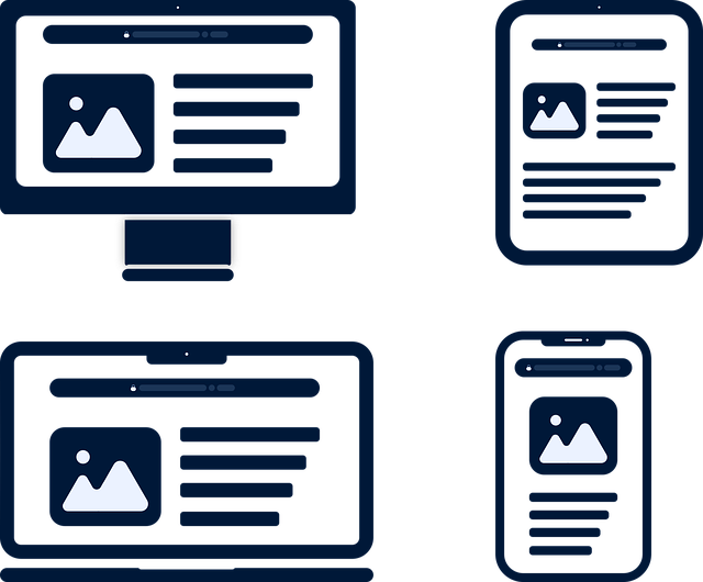
In the ever-evolving digital landscape, understanding mobile-first web design is no longer an option but a necessity. This approach marks a significant shift from the traditional desktop-centric paradigm. By prioritizing mobile devices, designers and developers ensure that websites are not just accessible but also optimized for smaller screens and varying user interactions. Mobile-responsive design involves creating flexible layouts, images, and cascading style sheets (CSS) that adapt to different device sizes and orientations.
This strategic shift ensures that users across a wide range of devices, from smartphones to tablets, have a seamless browsing experience. With mobile internet usage on the rise, adopting mobile-first practices allows businesses to reach a broader audience, improve user satisfaction, and enhance search engine optimization (SEO) rankings. By focusing on mobility first, developers can streamline content delivery, making websites faster, more efficient, and better suited to the modern digital lifestyle.
The Rationale: Why Mobile Responsiveness Matters

In today’s digital era, where mobile devices outnumber desktops, a mobile-first web design approach has become an indispensable strategy. The rationale behind this shift is clear: ensuring every website is mobile-responsive is crucial for providing an optimal user experience across all platforms. With vast amounts of internet traffic stemming from smartphones and tablets, it’s essential that websites adapt to these smaller screens, offering seamless navigation and accessible content.
Mobile responsiveness isn’t just about convenience; it’s a fundamental requirement for search engine optimization (SEO) as well. Google, for instance, favors mobile-friendly sites in its search rankings, meaning a mobile-first design can significantly boost online visibility. Furthermore, a responsive site automatically adjusts to different devices and screen sizes, ensuring that users on the go don’t encounter frustrating issues like text that’s too small to read or difficult-to-tap buttons.
Key Principles of Mobile-Responsive Design

Mobile-responsive design is an essential principle for any modern website, prioritizing adaptability and user experience across diverse devices. The key lies in creating a flexible layout that seamlessly adjusts to different screen sizes and orientations, ensuring content remains legible and easily navigable on both mobile phones and tablets. This approach involves utilizing media queries, flexible grids, and scalable images to build dynamic web pages that adapt gracefully as users switch between devices.
The primary goal is to provide an optimal viewing experience without compromising functionality. By implementing responsive design tactics, developers can ensure consistent performance, whether users are browsing on a compact smartphone screen or interacting with a larger tablet display. This adaptability not only caters to the growing mobile web traffic but also enhances search engine rankings, as search engines favor mobile-friendly websites, making it a crucial strategy for any digital presence in today’s mobile-driven world.
Creating a Mobile-First Layout: Best Practices

When creating a mobile-first layout, designers and developers should prioritize flexibility and adaptability. Start by designing for smaller screens, ensuring the website is optimized for various smartphone dimensions. This approach guarantees a seamless user experience, as visitors access content on their handsets, which are often more limited in size compared to desktop screens.
Best practices include using relative units like percentages instead of fixed pixel values, especially for widths and heights. This enables layouts to adjust gracefully across devices. Implement media queries effectively to apply specific styles tailored for different screen sizes, ensuring the website remains readable and usable on mobile platforms while maintaining a consistent brand aesthetic.
Tools and Technologies for Responsive Web Development
In the pursuit of delivering optimal user experiences across diverse devices, mobile-first web design has become a cornerstone of modern web development. To achieve this, developers have at their disposal a robust set of tools and technologies that facilitate responsive web development. Bootstrap, for instance, is a widely adopted CSS framework that offers pre-designed components and layouts, streamlining the process of creating mobile-responsive designs with minimal coding effort.
Additionally, JavaScript libraries like React, Angular, and Vue.js play a pivotal role in building dynamic and adaptive user interfaces. These libraries empower developers to create flexible, responsive web applications that seamlessly adjust to different screen sizes and resolutions. Moreover, advanced CSS techniques such as media queries, flexbox, and grid layouts enable precise control over the presentation of content on both mobile and desktop devices, ensuring a consistent and engaging user experience regardless of the platform.
Measuring and Optimizing Mobile User Experience

In the realm of mobile-first web design, understanding and optimizing the user experience (UX) on smartphones and tablets is paramount. Measuring UX involves tracking key performance indicators like load times, tap targets, and scroll depth to ensure a seamless, intuitive interaction. Tools like Google Analytics, heatmaps, and A/B testing play a crucial role in gathering data, identifying pain points, and refining the layout for various screen sizes.
A mobile-responsive design approach ensures that websites adapt gracefully across devices, providing an optimal viewing experience regardless of the user’s screen size or orientation. By prioritizing mobile users, designers can foster higher engagement, reduced bounce rates, and improved conversion metrics—essential aspects for any successful online presence in today’s digital era.