
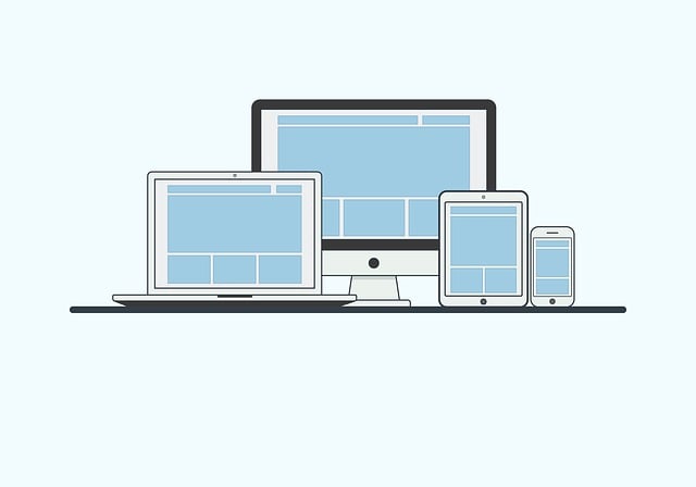
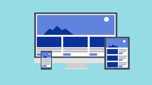
In today's mobile-first world, businesses need a responsive UI design strategy for optimal user experiences across all devices. This involves adaptive layouts, optimized content, and dynamic adjustments based on screen sizes. Benefits include enhanced engagement, improved SEO rankings, increased conversions, and a competitive edge in the digital landscape. By prioritizing responsive design, companies can cater to diverse users, drive growth, and stay ahead in an evolving digital realm. Key practices include flexible grids, media queries, minimalism, fast loading times, and using tools like Bootstrap. Measuring success through key metrics shows improved user engagement and business performance. The future includes AI-driven personalization and integration across connected platforms.
In an era dominated by mobile connectivity, the shift towards smartphones as primary internet access devices is undeniable. This paradigm change demands that businesses prioritize a crucial aspect: adopting a responsive UI design. This article explores the growing significance of mobile-friendly websites and provides an in-depth guide to achieving optimal user experiences across all screens. From understanding the rise of mobile browsing’s impact on businesses to delving into key components, best practices, and future trends, we unravel the essential elements of responsive UI design for modern digital success.
- The Rise of Mobile Internet Usage and Its Impact on Businesses
- Understanding Responsive UI Design: Definition and Benefits
- Why Is a Responsive Website Essential for Modern Businesses?
- Key Components of a Successful Responsive UI Design
- Strategies to Enhance User Experience Across Devices
- Best Practices for Creating Visually Appealing Responsive Websites
- Technical Aspects: Tools and Technologies for Responsive Web Development
- Measuring Success: Evaluating the Effectiveness of Responsive Designs
- Future Trends in Mobile-Friendly Web Design
The Rise of Mobile Internet Usage and Its Impact on Businesses

The shift towards mobile internet usage has been nothing short of monumental. With smartphones now ubiquitous, users across the globe are increasingly accessing the web via their handsets, transforming how businesses operate and engage with customers. This paradigm shift necessitates a corresponding evolution in digital presence; a responsive UI design is no longer a luxury but a fundamental requirement.
Businesses that fail to adapt to this mobile-first landscape risk losing out on a massive audience and damaging their reputation. Custom responsive web solutions offer a strategic advantage, allowing companies to create full-responsive web design services that mirror the user experience across all devices, from desktops to tablets to smartphones. This ensures consistent engagement, higher customer satisfaction, and ultimately, increased conversion rates.
Understanding Responsive UI Design: Definition and Benefits

Responsive UI design is an approach that ensures a website’s user interface adapts seamlessly to various screen sizes and devices. It’s no longer adequate for websites to be designed solely for desktop browsers; with mobile internet usage surpassing desktop, responsive design has become a fundamental requirement. This methodology involves creating flexible layouts, utilizing relative sizing, and applying media queries to adjust content and visual elements according to the user’s device.
The benefits of responsive UI design are vast. It enhances user experience by providing a consistent interface across devices, improving accessibility for all users regardless of their technology choices. Additionally, it offers SEO advantages with search engines favoring mobile-friendly sites. Moreover, full-responsive web design services can significantly boost engagement and conversions, ensuring your website remains competitive in the digital landscape while catering to modern browsing habits.
Why Is a Responsive Website Essential for Modern Businesses?

In today’s digital era, where smartphone usage for internet browsing surpasses desktop traffic, a responsive website is no longer a luxury but an absolute necessity for modern businesses. Traditional websites often fail to adapt to smaller screens, resulting in a frustrating user experience with limited functionality and readability. This is where Full-Responsive Web Design Services come into play, ensuring your site seamlessly adjusts to any device, be it a smartphone, tablet, or desktop computer. By adopting Mobile-First Web Design strategies, our designers prioritize the mobile viewing experience first, guaranteeing a consistent and accessible layout for all users.
A Business Website Responsive Design is crucial for several reasons. It enhances user engagement by providing an intuitive interface that allows visitors to easily navigate and interact with your content. Moreover, search engines favor responsive sites, improving your online visibility and SEO rankings. By embracing responsive UI design, businesses can cater to a broader audience, including those who primarily use mobile devices, thereby expanding their customer reach and increasing potential sales.
Key Components of a Successful Responsive UI Design
A successful responsive UI design is pivotal in today’s mobile-first world, ensuring that a business website responsive design adapts seamlessly to various screen sizes and devices. Key components include a fluid grid system that rearranges content intelligently, making it scalable responsive web design across desktops, tablets, and smartphones. Each element should be carefully considered for optimal visibility and interactivity on different platforms, from the placement of navigation menus to the responsiveness of forms and buttons.
Additionally, an interactive mobile design approach involves enhancing user engagement through touch-optimized interactions. This means incorporating gestures, swipes, and pinch actions that feel natural on mobile devices, thereby improving user experience. A well-designed responsive UI not only captivates users but also drives conversions, demonstrating the importance of a robust business website responsive design strategy in the digital landscape.
Strategies to Enhance User Experience Across Devices

In the quest for an optimal user experience, especially with smartphone internet usage on the rise, businesses must embrace strategies that align with a user-friendly responsive web design. The cornerstone of this approach is responsive UI design, which ensures websites adapt gracefully to various screen sizes and resolutions. This means visitors can seamlessly navigate and interact with your website, regardless of whether they’re using a smartphone, tablet, or desktop computer.
A successful responsive website design involves creating a flexible layout that reorganizes content and visual elements based on the available screen real estate. This adaptability not only provides an aesthetically pleasing experience but also enhances functionality. For instance, touch gestures should be intuitive for mobile users while still allowing for efficient keyboard and mouse interactions on larger screens. By prioritizing this business website responsive design, companies can foster user engagement, improve conversion rates, and leave a positive impression that encourages return visits.
Best Practices for Creating Visually Appealing Responsive Websites

To create visually appealing responsive websites that cater to a wide range of devices, designers should adhere to best practices such as using flexible grids and images that adapt to different screen sizes. A key aspect is ensuring consistent styling across all platforms, maintaining a clean layout with easy navigation, and optimizing content for readability on both small and large screens. Incorporating media queries allows for dynamic adjustments based on device capabilities, enhancing user experience.
Additionally, leveraging modern design trends like minimalism and flat design can result in elegant, intuitive interfaces. Responsive UI design should also prioritize fast loading times by compressing images and minimizing HTTP requests. When considering a Local Responsive Web Designer or Affordable Responsive Design solutions, it’s crucial to evaluate their portfolio and expertise in creating visually stunning and functional responsive web designs tailored for E-commerce platforms.
Technical Aspects: Tools and Technologies for Responsive Web Development
The cornerstone of a successful mobile-friendly web design lies in responsive UI design—a technical marvel that enables websites to adapt gracefully across various device screens, from smartphones to tablets and desktops. Tools like Bootstrap, a popular front-end framework, streamline the process by providing pre-built CSS styles and JavaScript components, simplifying the creation of scalable responsive web designs. These tools offer a robust foundation, allowing developers to construct layouts that adjust intelligently based on screen dimensions, ensuring optimal viewing and user interaction regardless of device limitations.
Additionally, technologies such as CSS media queries play a pivotal role in achieving responsive website design. By enabling developers to apply specific styles based on device characteristics, media queries facilitate the dynamic adjustment of elements like font sizes, image layouts, and menu navigations. This adaptability ensures not only an aesthetically pleasing mobile-friendly web design but also enhances user experience by delivering content that is easy to consume on smaller screens, making it a key component in any modern web development strategy.
Measuring Success: Evaluating the Effectiveness of Responsive Designs

Measuring success is a crucial step in evaluating the effectiveness of responsive UI design. It involves assessing how well a website adapts to different screen sizes and devices, ensuring a consistent user experience across the board. Key metrics include load times, click-through rates (CTR), conversion rates, and bounce rates. By comparing these figures before and after implementing a responsive design, businesses can gauge the impact on user engagement and overall website performance.
For instance, mobile optimization for websites has shown significant improvements in user retention and satisfaction through adaptive web design. Full-responsive web design services that prioritize user interface flexibility and accessibility not only enhance the visual appeal but also streamline interactions. This leads to better engagement, increased time spent on site, and higher chances of conversions, ultimately driving business growth and success in today’s mobile-first landscape.
Future Trends in Mobile-Friendly Web Design

The future of mobile-friendly web design is poised for even greater innovation and adaptability. As smartphone usage continues to dominate internet browsing, designers are exploring ways to enhance user experiences further. One emerging trend is the integration of artificial intelligence (AI) and machine learning to create dynamic and personalized interfaces that adjust in real-time based on user behavior and preferences. This ensures that each visitor receives a tailored experience, optimizing engagement and conversion rates.
Additionally, with the rise of Internet of Things (IoT) devices, designing for a seamless transition between various screens and platforms will be crucial. Responsive UI design will evolve to accommodate smart watches, TVs, and other connected devices, offering a unified and consistent user journey across all touchpoints. This scalable responsive web design approach not only caters to current trends but also ensures that businesses stay ahead of the curve in an ever-changing digital landscape, providing affordable responsive design solutions without compromising on quality or functionality.