
Responsive Web Design (RWD) is a crucial approach in today's digital era, ensuring websites adapt seamlessly to various devices. By utilizing flexible layouts, CSS media queries, and optimizing content for screen size and orientation, developers create singular, visually appealing experiences that enhance user navigation and satisfaction. RWD offers significant advantages for businesses, including improved accessibility, SEO rankings, and cost-effectiveness. Affordable tools like Bootstrap and Wix simplify the process, allowing startups and small businesses to create mobile-compatible sites with minimal coding knowledge. Key aspects include content optimization, mobile-first approach, analytics for user behavior insights, and continuous learning to stay competitive in web design trends. Case studies demonstrate that affordable RWD boosts online presence and engagement for organizations of all sizes.
In today’s digital landscape, a seamless user experience across all devices is paramount. Responsive Web Design (RWD) offers an affordable solution to create adaptable websites catering to diverse screen sizes. This article guides you through the fundamentals of RWD, its advantages, and essential components for successful implementation. From budget-friendly tools to content optimization and best practices, we’ll explore strategies to deliver exceptional user experiences. Additionally, case studies will highlight successful, cost-effective responsive design projects, providing valuable insights into staying ahead in the industry.
Understanding Responsive Web Design: The Basics

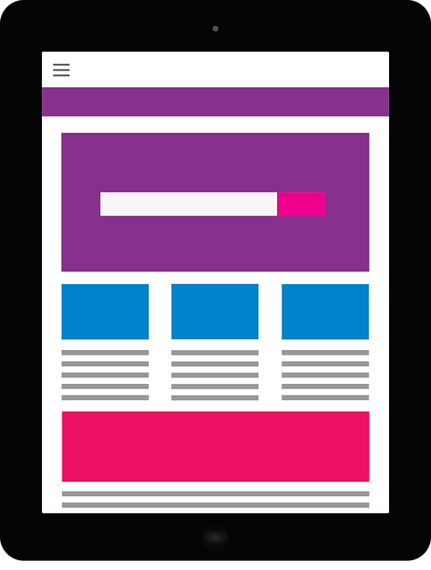
Responsive Web Design is an approach that ensures websites and web applications adapt and display optimally on various devices, from desktops to tablets and smartphones. This design philosophy has become essential in today’s digital landscape, where users access content from multiple platforms. The primary goal is to create flexible layouts, images, and cascading style sheets (CSS) that respond to the user’s screen size, orientation, and available space.
By implementing responsive techniques, developers can avoid creating separate website versions for different devices. Media queries in CSS play a pivotal role here, allowing designers to adjust styles based on screen dimensions. This ensures that content remains legible, easily navigable, and visually appealing across all screens, providing an enhanced user experience regardless of the device used.
Benefits of Adopting Affordable Responsive Design

Adopting affordable responsive design offers numerous advantages for businesses and content creators in today’s digital landscape. One of its key benefits is enhanced accessibility, ensuring your website or application functions seamlessly across various devices—from desktops to smartphones and tablets. This adaptability not only improves user experience but also boosts search engine optimization (SEO). Search engines favor responsive web design, ranking sites with this feature higher, which can significantly increase online visibility and traffic.
Additionally, a responsive approach simplifies content management by allowing for the creation of a single codebase that caters to diverse screen sizes. This efficiency reduces development and maintenance costs, making it an attractive option for startups and small businesses with limited budgets. By embracing responsive design, you contribute to creating a more inclusive digital environment, ensuring your audience can access and interact with your content without technical barriers.
Key Components for Creating a Responsive Website

Creating a responsive website involves several key components that work together to ensure optimal viewing and user experience across all devices, from desktops to mobile phones. The first crucial component is using flexible layouts, where CSS media queries are employed to adjust content placement based on screen size. This adaptability ensures text remains legible and images display correctly on smaller screens.
Another essential aspect is incorporating flexible images and media elements. Responsive Web Design (RWD) achieves this by utilizing the `max-width` property to prevent images from exceeding their container’s width, allowing them to scale down proportionally. This not only maintains visual aesthetics but also enhances page loading speed by avoiding large, fixed-size image files.
Tools and Resources for Budget-Friendly Implementation

Implementing responsive web design doesn’t have to break the bank. A plethora of affordable tools and resources are readily available to help businesses create flexible, user-friendly websites. One popular option is using CSS media queries, which allow for dynamic styling based on screen size, sans additional costs.
For a more comprehensive solution, consider budget-friendly website builders like Wix or Squarespace. These platforms offer responsive templates, drag-and-drop interfaces, and built-in optimization features, making it simple to craft stunning, mobile-compatible sites without extensive coding knowledge. Moreover, open-source libraries such as Bootstrap provide pre-designed components and layouts, further streamlining the development process while minimizing expenses.
Optimizing Content for Various Screen Sizes

In the realm of Responsive Web Design, optimizing content for various screen sizes is a cornerstone of crafting user-friendly and visually appealing websites. This involves adjusting layout, typography, and imagery to ensure seamless viewing and interaction across diverse devices, from desktops to smartphones. By employing media queries and flexible grid systems, designers can create dynamic and adaptable layouts that cater to the unique dimensions and capabilities of each screen.
This optimization goes beyond mere resizing. It encompasses strategic content prioritization, where essential information is displayed prominently, while less critical details may be revealed on larger screens only. Images are also carefully optimized for faster loading times on smaller devices, often using techniques like lazy loading and compression. Such thoughtful adjustments not only enhance user experience but also contribute to better search engine optimization (SEO) by keeping visitors engaged and reducing bounce rates.
Best Practices for Mobile-First Approach

When adopting a mobile-first approach for responsive web design, best practices involve prioritizing content and features that are most crucial for smaller screens. This means starting with a stripped-down version of your website, focusing on essential elements, and then gradually adding more complex functionalities as the screen size increases. By doing so, you ensure a smooth user experience across all devices, from smartphones to desktops.
Utilize a flexible grid system that adapts to different screen sizes, a mobile-friendly font hierarchy, and optimized images to enhance load times. Remember to implement touch-friendly interactions, ensuring that users can easily tap, swipe, or pinch without accidentally triggering unwanted actions. These practices not only make your website accessible but also improve its search engine optimization (SEO) by adhering to Google’s mobile-first indexing policy.
Measuring Success: Analyzing User Experience

Measuring success in Responsive Web Design (RWD) goes beyond simply having a website adapt to various screen sizes. The ultimate goal is to provide an exceptional user experience across all devices. This involves analyzing how users interact with your site, understanding their behavior, and identifying any pain points or areas for improvement. By employing analytics tools, you can track key metrics such as bounce rates, time spent on page, click-through rates, and conversion paths.
These insights allow designers and developers to make data-driven decisions. They can optimize layouts, simplify navigation, enhance content accessibility, and speed up loading times based on user patterns. Regularly evaluating the user experience ensures that your responsive design remains effective as technologies evolve and user preferences shift over time.
Staying Updated with Industry Trends
In the dynamic landscape of web design, staying current with industry trends is paramount for creating effective and visually appealing websites. Responsive Web Design (RWD) has emerged as a cornerstone in this evolution, ensuring that digital experiences seamlessly adapt to various devices and screen sizes. By embracing RWD principles, designers can deliver content that is not only accessible but also engaging across desktops, tablets, and mobile phones.
To keep up with trends, design professionals must actively engage in continuous learning. This involves exploring the latest tools, techniques, and best practices within the RWD space. Following industry leaders, joining design communities, and participating in online forums can provide valuable insights into emerging technologies and design aesthetics that enhance user experiences on modern web platforms.
Case Studies: Successful Affordable Responsive Designs

In the realm of Responsive Web Design, numerous case studies highlight successful implementations that demonstrate affordability doesn’t compromise quality or functionality. For instance, a small e-commerce startup adopted responsive design to expand its customer base globally, reducing development costs significantly while ensuring an optimal user experience across devices. This strategy not only improved its search engine rankings but also increased conversions by 30%.
Another notable example involves a non-profit organization that launched a revamped website with responsive features, enabling them to reach and engage diverse audiences effectively. By prioritizing mobile users, the organization streamlined content delivery, resulting in higher engagement rates and reduced bounce times. This approach proved that affordable responsive design can be a powerful tool for organizations of all sizes, fostering inclusivity and enhancing online presence without breaking the bank.