
The digital landscape has shifted dramatically with the rise of smartphones, making responsive mobile design crucial for web developers. Optimizing websites for mobile devices is no longer optional but essential, as nearly everyone carries powerful computers in their pockets. Responsive mobile design, driven by media queries, flexible grids, and fluid images, ensures websites adapt seamlessly to various screen sizes, enhancing user interaction and functionality. Prioritizing mobile usability and a mobile-first approach are vital for creating superior user experiences across all platforms and improving search engine optimization (SEO). Using tools like Google's Mobile-Friendly Test helps assess and rectify issues before launch. Implementing responsive mobile design strategies is affordable, reduces costs, and enhances user engagement and SEO. By focusing on smaller screens and touch interfaces, businesses create positive first impressions, encourage repeat interactions, and boost organic traffic, ultimately leading to increased visibility and improved conversion rates.
In today’s digital landscape, adopting a mobile-first design approach is no longer an option but a necessity. With smartphones as the primary gateway to the internet, ensuring your website is optimized for smaller screens is crucial. This strategy involves creating responsive mobile designs that adapt seamlessly to various device sizes, offering a consistent user experience. By prioritizing mobile usability, web designers can subsequently enhance larger screen interfaces while maintaining simplicity and intuitiveness.
This article explores why embracing a mobile-first mindset is vital, from improved SEO rankings to increased user satisfaction, all while providing practical guidance on implementation, even on a budget. We’ll delve into the key benefits of this approach and the tools available to assess and optimize your website for optimal mobile compatibility.
- The Shift to Mobile-First Design
- Understanding Responsive Mobile Design
- Benefits of Prioritizing Mobile Usability
- Tools for Assessing Mobile Compatibility
- Implementing a Mobile-Centric Approach on a Budget
- Long-Term Impact on User Engagement and SEO
The Shift to Mobile-First Design
The digital landscape has undergone a profound transformation with the advent of smartphones, leading to a significant shift in design philosophy towards a mobile-first approach. In today’s world, where nearly everyone carries a powerful computer in their pockets, ensuring your website is optimized for mobile devices is no longer an option but a necessity. This paradigm change demands that web designers prioritize creating responsive mobile designs that seamlessly adjust to various screen sizes and resolutions.
By embracing adaptive web design, developers can build user-friendly mobile websites that offer the same level of functionality and aesthetics as their larger counterparts. This strategy not only caters to the growing demand for seamless digital experiences across devices but also aligns with search engine optimization (SEO) best practices. Google’s leadership in this regard is evident through its preferential treatment of mobile-friendly sites in search rankings, further emphasizing the importance of professional mobile web design in achieving online success and reaching a broader audience.
Understanding Responsive Mobile Design

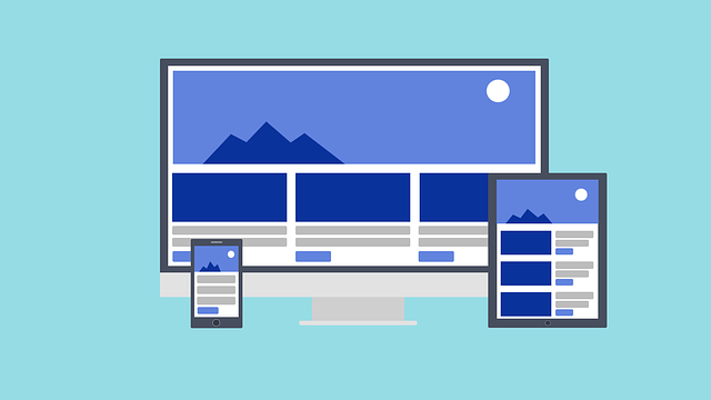
Responsive mobile design is a fundamental concept in modern web development. It involves creating websites that can dynamically adjust their layout and content to fit various screen sizes, ensuring optimal viewing and user interaction across different devices. This approach leverages media queries, flexible grids, and fluid images to deliver a seamless experience on smartphones, tablets, and desktops alike. By understanding user behavior and device limitations, designers can create mobile sites that are not only visually appealing but also highly functional.
In the context of mobile site development, responsive design is more than just making a website look good on smaller screens; it’s about providing a practical and enjoyable experience for users. This strategy, often referred to as full-responsive web design, allows businesses to offer responsive web solutions that cater to their audience’s needs, regardless of the device they’re using. As mobile internet usage continues to grow, embracing responsive mobile design is not just an option but a necessity for any forward-thinking business aiming to maintain its online relevance and attract a wide range of users.
Benefits of Prioritizing Mobile Usability

Prioritizing mobile usability offers a multitude of benefits for modern web design. With smartphones dominating internet access, users expect seamless and intuitive experiences on their devices. A mobile-first approach ensures that your website is not only accessible but also provides a superior user experience across all platforms. This strategy involves creating responsive mobile designs that adapt gracefully to various screen sizes, making content easily consumable and navigation simple even on smaller screens.
By adopting an expert mobile web design strategy, you can create SEO-friendly mobile websites that not only attract visitors but also keep them engaged. Responsive website design ensures your site is optimized for search engines like Google, boosting its ranking in mobile searches. This holistic approach not only enhances user satisfaction but also translates to better conversion rates and a stronger online presence, making it an indispensable component of any successful digital strategy.
Tools for Assessing Mobile Compatibility

Assessing mobile compatibility is an essential step in ensuring your website meets the highest standards for user experience. Tools like Google’s Mobile-Friendly Test are invaluable for this purpose, offering a quick and easy way to gauge how well your site performs on both desktop and mobile devices. By inputting your website’s URL, this tool provides detailed insights into various aspects of its mobile usability, including whether the content is easily readable, if navigation is intuitive, and if essential elements are properly optimized for smaller screens.
Additionally, these tools can identify issues related to responsive mobile design, such as slow loading times or poorly formatted content. This proactive assessment allows web designers, especially local mobile web designers, to make necessary adjustments before launching the site. By focusing on creating a seamless, mobile-friendly experience, from the outset, you not only attract more visitors but also foster higher engagement and satisfaction among your target audience, thereby enhancing the overall success of your online presence. This is particularly important for small businesses looking to create custom mobile-friendly websites that stand out in a competitive market.
Implementing a Mobile-Centric Approach on a Budget

Implementing a mobile-centric approach doesn’t have to break the bank, even for businesses operating on a tight budget. The key lies in prioritizing essential elements that enhance user experience on smaller screens. Instead of focusing on creating separate desktop and mobile versions of your website, adopt a responsive mobile design strategy. This involves crafting a single, dynamic layout that seamlessly adjusts to different device sizes and orientations. Utilize flexible grids, relative units like percentages instead of fixed pixels, and prioritize visible content to ensure your site looks great and functions flawlessly across all mobile devices.
Leveraging cost-effective solutions and pre-built templates can significantly reduce development time and expenses. Many content management systems (CMS) like WordPress offer a wide array of responsive themes designed specifically for mobile web development. These themes are often highly customizable, allowing you to tailor them to your brand’s unique needs without incurring high development costs. Regularly testing on various devices and using tools like Google’s Mobile-Friendly Test will help ensure your user-friendly mobile websites perform optimally, providing a positive experience for visitors regardless of their preferred device.
Long-Term Impact on User Engagement and SEO

Adopting a mobile-first approach has a profound long-term impact on user engagement and SEO. By prioritizing smaller screens and touch interfaces, businesses create an initial positive impression that sets the stage for subsequent interactions across different devices. Users are more likely to return to a website that offers a seamless experience from the get-go, regardless if they’re using a smartphone, tablet, or desktop. This loyalty translates into higher engagement metrics such as page views per session and time spent on site.
Furthermore, search engines like Google actively favor mobile-friendly web design in their rankings. A responsive mobile design ensures that your website isn’t just accessible but also performs well in search results. This direct correlation between mobile usability and SEO drives organic traffic, which is crucial for long-term business growth. Investing in a robust mobile-first strategy today means reaping the benefits of increased visibility and higher conversion rates tomorrow.