
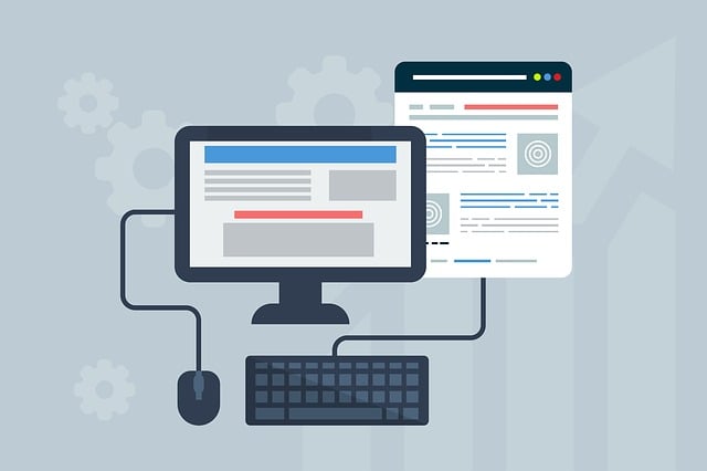
Responsive Web Design (RWD) is a modern approach ensuring websites adapt gracefully to various screen sizes and devices, enhancing user experience and boosting satisfaction. Key components include mobile-first design, flexible grids, media queries for layout adjustments, optimized images, consistent branding, versatile typography, and an effective color palette. Best practices involve testing across device types, simulating different screen sizes, and leveraging emulators. Trends in RWD include voice search optimization, AI/ML integration, and AR/VR technologies, pushing the boundaries towards dynamic and intuitive experiences.
Responsive web design is no longer a nicety—it’s a necessity. In today’s digital landscape, users access websites across a multitude of devices, from desktops to smartphones and tablets. Understanding and implementing responsive design ensures a seamless user experience regardless of screen size or orientation. This comprehensive guide explores the fundamentals, benefits, key components, best practices, and future trends in responsive web design, empowering developers to create adaptable and accessible online experiences for all.
Understanding Responsive Web Design: The Basics

Responsive Web Design, or RWD, is an approach that ensures websites adapt seamlessly to different screen sizes and devices. It’s no longer about creating static pages that look good on a desktop monitor; instead, it focuses on building dynamic, flexible layouts that cater to everything from large desktops to tiny smartphones. The core idea revolves around using flexible grids, images that adjust, and cascading style sheet media queries to deliver an optimal viewing experience regardless of the user’s hardware.
This methodology has become not just a best practice but a necessity in today’s digital landscape. With users accessing the internet through various devices, from tablets to wearables, responsive design guarantees your website remains user-friendly, accessible, and visually appealing across all platforms. By embracing RWD, web developers can create sites that offer fast loading times, easy navigation, and consistent content presentation, ultimately enhancing user satisfaction and engagement.
Why Responsive Design is Essential for Modern Websites
In today’s digital era, where users access the internet through a myriad of devices, from desktops to smartphones and tablets, having a responsive website design is no longer a luxury but an essential requirement. Responsive Web Design (RWD) ensures that websites adapt seamlessly to different screen sizes and resolutions, providing an optimal viewing experience regardless of the device being used. This approach is crucial as it caters to the diverse needs of modern users who expect instant access to information and services on their preferred platforms.
A responsive design not only enhances user satisfaction but also offers several strategic advantages for businesses. It improves search engine optimisation (SEO) by allowing search engines to index a single URL for various device views, thereby increasing visibility and traffic. Moreover, RWD reduces development and maintenance costs as one codebase needs to be maintained, making it an efficient and cost-effective solution in the long run.
Key Components of a Successful Responsive Website

A successful responsive website design is an art that seamlessly adapts content and layout across various devices, from desktops to smartphones. Key components include a mobile-first approach, where the design prioritizes smaller screens, ensuring fast loading times and easy navigation. This involves optimizing images, using CSS media queries to adjust layouts, and implementing a flexible grid system.
Additionally, a robust responsive design considers user experience, offering intuitive interactions and consistent branding regardless of the device. It also embraces versatile typography, where fonts adapt to different screen sizes, and a simple yet effective color palette that enhances readability. These components collectively contribute to creating a visually appealing and functional website, catering to users across diverse platforms.
Best Practices for Creating Responsive Layouts

Creating responsive layouts is a key aspect of modern Responsive Web Design, ensuring websites adapt seamlessly to various screen sizes and devices. Best practices include employing a mobile-first approach, where designs are optimized for smaller screens before scaling up for larger ones. This strategy guarantees that the content loads faster on mobile devices and improves user experience overall.
Utilizing flexible grids and images that resize proportionally is another effective technique. These elements should adjust dynamically based on the available space, ensuring the website maintains its visual appeal regardless of the device. Additionally, developers should leverage media queries to apply specific styles for different screen resolutions, allowing for precise control over how the site appears on desktops, tablets, and smartphones.
Media Queries: A Powerful Tool for Adaptability

Media queries are a game-changer in the realm of responsive web design, allowing developers to create websites that adapt seamlessly to various devices and screen sizes. This powerful tool enables designers to apply specific CSS styles based on an element’s characteristics, such as its width or orientation. By using media queries, developers can ensure that a website looks and functions perfectly on desktops, tablets, and mobile phones alike.
With media queries, the layout and design of a site can be altered dynamically, making it a cornerstone of modern web development. They offer a flexible approach to responsiveness, enabling creative solutions for presenting content and ensuring an optimal user experience across different platforms.
Testing and Optimizing for Various Devices and Screens

Testing and optimizing a website for various devices and screens is a cornerstone of responsive web design. This process ensures that the user experience remains seamless regardless of whether a visitor is using a desktop computer, tablet, or smartphone. It involves simulating different screen sizes and orientations to identify potential layout issues, content overlap, or functionality problems. Tools like emulators and real-device testing can help developers catch and fix these issues early in the development cycle.
By focusing on mobile-first strategies, developers can create flexible layouts that adapt gracefully to different screen resolutions. Optimizing images, utilizing CSS media queries, and prioritizing core content ensures fast loading times even on slower connections. These techniques not only enhance usability but also significantly improve search engine optimization (SEO) rankings, as search engines favor websites that provide a positive user experience across all platforms.
Future Trends in Responsive Web Design

As technology continues to evolve, so do the demands and expectations of internet users. This pushes the boundaries of Responsive Web Design (RWD), pushing designers and developers to create more dynamic, flexible, and intuitive digital experiences. One prominent trend is the increasing importance of voice search optimization. With virtual assistants becoming household names, websites need to be optimized for voice queries, focusing on natural language processing and conversational design.
Another emerging trend is the integration of Artificial Intelligence (AI) and Machine Learning (ML). AI-powered chatbots are already being used for customer service, but in the future, we can expect more sophisticated interactions, with personalized content recommendations and dynamic layout adjustments based on user behavior. Additionally, Augmented Reality (AR) and Virtual Reality (VR) technologies will play a significant role in enhancing user engagement, offering immersive experiences that blur the line between physical and digital worlds.