
In web design, User Experience (UX) is paramount for creating engaging destinations that enhance user interaction and satisfaction. Effective UX incorporates intuitive navigation, visual hierarchy, and accessible content flow. Responsive web design ensures optimal viewing experiences across diverse devices, boosting engagement and SEO. Color schemes and typography significantly impact visual appeal and user experience, with strategic choices evoking emotions and improving readability. Balancing aesthetics and functionality is crucial for successful web design, fostering user engagement and conversions. Efficient content organization through clear hierarchies and effective whitespace enhances UX and SEO.
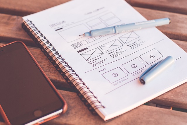
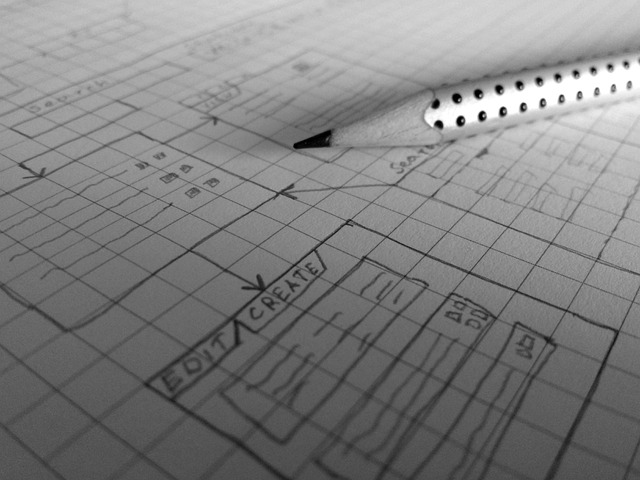
Website layout design is a critical aspect of web development, shaping user experiences and driving engagement. In today’s digital landscape, effective web design goes beyond aesthetics; it revolves around understanding user needs and behavior through robust User Experience (UX) principles. This article explores key elements, from responsive design to color schemes, balancing functionality and aesthetics, and best practices for content organization. By delving into these aspects, we provide valuable insights for creating exceptional web designs that captivate and convert users.
Understanding User Experience and Its Impact on Web Design
In the realm of web design, User Experience (UX) is a cornerstone that transforms mere websites into engaging destinations. It involves understanding how users interact with digital spaces and optimizing each touchpoint to facilitate seamless navigation and satisfaction. A well-designed UX considers user needs, preferences, and behaviors, ensuring the website is intuitive, accessible, and enjoyable to use. This, in turn, fosters higher user engagement, encourages site visitors to explore further, and boosts conversion rates for businesses.
Effective web design leverages UX principles to create layouts that guide users through a logical flow of information. It involves careful consideration of visual hierarchy, navigation systems, content placement, and interactive elements. By prioritizing user needs, designers can build websites that not only look appealing but also deliver a consistent and positive experience. This impact extends beyond individual visits; a well-crafted UX fosters brand loyalty, encourages word-of-mouth recommendations, and contributes to the overall success of online businesses.
Key Elements of an Effective Website Layout

An effective website layout is crucial for engaging users and enhancing their online experience, which is paramount in today’s digital era. Core elements include a clear navigation system that allows visitors to effortlessly explore different sections of your site. Intuitive menus, breadcrumb trails, and search functions are vital tools to guide users through the content landscape.
Visual hierarchy plays a significant role too, guiding users’ eyes to the most important information first. This can be achieved through strategic use of contrasting colors, sizes, and placement. Balancing text with high-quality visuals, such as images and videos, creates an appealing layout that captivates users. The goal is to create a harmonious balance between aesthetics and functionality, ensuring the website not only looks good but also performs effectively.
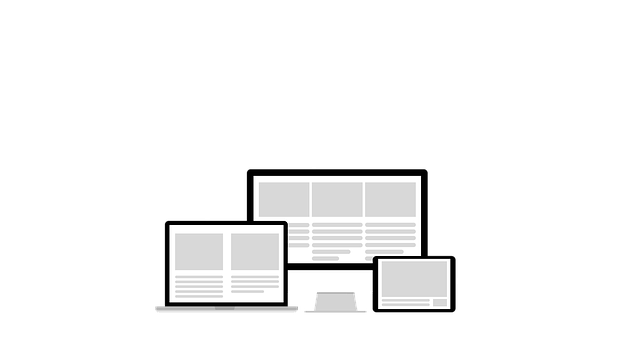
Importance of Responsive Design for Modern Websites

In today’s digital era, a website’s success is heavily reliant on its ability to adapt and cater to diverse user experiences. This is where responsive web design plays a pivotal role in modern web design strategies. With an increasing number of users accessing websites through various devices, from desktops to smartphones, tablets, and even smart watches, a responsive layout ensures your site provides an optimal viewing experience regardless of the screen size or orientation.
Responsive design isn’t just about making a website look good on different devices; it’s about enhancing usability, improving user engagement, and boosting search engine optimisation (SEO) efforts. By utilising flexible grids, flexible images, and media queries, web designers can create layouts that adjust seamlessly to any screen, ensuring fast loading times, easy navigation, and consistent branding across all platforms. This approach not only satisfies users but also positions your website favorably in search engine rankings, making it a crucial aspect of successful web design practices.
Color Schemes and Typography Choices in Web Layouts

Color schemes and typography choices are fundamental aspects of web design, playing a pivotal role in shaping the visual identity and user experience of a website. The right combination of colors and fonts can instantly evoke emotions, convey brand personality, and guide users through the interface. For instance, warm tones like orange and yellow create a vibrant atmosphere, suitable for e-commerce sites aiming to stimulate purchases. On the other hand, cool shades such as blue and green impart trust and calmness, making them ideal for corporate or healthcare websites.
Typography decisions are equally significant. Selecting legible fonts with appropriate sizes and weights ensures readability across various devices. Pairing contrasting styles—a bold headline with a simple body text, for example—can enhance hierarchy and focus on key content. Moreover, considering accessibility guidelines, such as providing sufficient contrast between text and background, is essential to ensure all users can comfortably interact with the website.
Balancing Functionality and Aesthetics in Design
In web design, achieving a harmonious balance between functionality and aesthetics is an art. While a visually appealing website captures attention, its true success lies in how well it serves its users. Each element on a webpage should have a purpose, ensuring a seamless user experience. A poorly designed site with stunning visuals but clunky navigation or slow loading times will not retain visitors for long.
Therefore, designers must strive for a delicate equilibrium. User-friendly interfaces, intuitive navigation, and efficient content delivery are fundamental to good web design. Simultaneously, incorporating aesthetically pleasing layouts, color schemes, and typography enhances the overall user perception. Ultimately, a website that offers both functionality and visual appeal is more likely to engage visitors, encouraging them to explore further and ultimately convert into valuable customers or followers.
Best Practices for Navigating and Organizing Website Content
When designing a website, effective content organization is key to enhancing user experience and boosting engagement. A well-structured layout ensures visitors can navigate seamlessly, finding relevant information quickly. Start by creating a clear hierarchy; organize content into logical sections with consistent labeling. Utilize breadcrumbs to guide users through the site’s structure, especially on complex websites. This simple addition helps folks understand their current location and provides easy access to higher-level pages.
Visual cues are also essential. Implement intuitive menus, utilizing drop-down options for better space optimization. Keep page titles descriptive and unique, allowing visitors to grasp the content instantly. Additionally, utilize whitespace effectively; this negative space improves readability and prevents content overload. Remember, a clean, organized layout not only makes your web design more aesthetically pleasing but also plays a crucial role in search engine optimization (Web Design).