
TL;DR:
Responsive Web Design (RWD) is essential for modern websites to adapt seamlessly to various screen sizes and devices, catering to mobile-first users. Benefits include broader audience reach, improved user experience, enhanced SEO rankings, and better online visibility. Key components of a high-quality mobile website include fast loading times, intuitive navigation, mobile-specific features, and accessibility. Prioritizing user experience ensures longer interaction times and fosters engagement. RWD, combined with tools like Bootstrap, Tailwind CSS, React, and design software like Adobe XD, Figma, and Sketch, creates visually appealing and functional mobile sites that enhance performance and user satisfaction.
In today’s mobile-first world, high-quality mobile website design is not just desirable—it’s essential. This comprehensive guide explores the cornerstone of modern websites: Responsive Web Design, ensuring every screen size and device type receives an optimal experience. We delve into key components, user experience prioritization, visual optimization for small screens, content strategy tailored for mobile audiences, performance enhancements, and powerful tools for creating responsive sites. By embracing these principles, businesses can deliver exceptional experiences that resonate with users across devices.
Understanding Responsive Web Design: The Cornerstone of Modern Websites

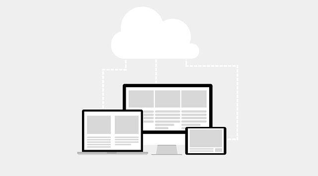
Responsive web design is no longer a luxury, but an essential cornerstone for modern websites. It ensures that digital spaces seamlessly adapt to various screen sizes and devices, from desktops to smartphones and tablets. This approach is crucial in today’s mobile-first world, where users expect instant access to information and services via their handsets. By implementing responsive design, businesses can cater to a broader audience, enhance user experience, and improve search engine optimization (SEO).
At its core, Responsive Web Design (RWD) focuses on flexible layouts, images, and CSS that adjust based on the screen’s dimensions. This means users enjoy consistent, easy-to-navigate experiences across different platforms. Google, for instance, favors mobile-friendly websites in its search rankings, making RWD a strategic must for online visibility.
Key Components for High-Quality Mobile Website Design
Creating a high-quality mobile website design involves several key components that are essential for providing an optimal user experience across various devices. One of the most critical aspects is responsive web design. This means your website seamlessly adjusts to different screen sizes and resolutions, ensuring content remains legible and functionalities work flawlessly on smartphones, tablets, and desktops. Responsive design not only caters to a broader audience but also improves search engine rankings, as Google and other major engines prioritize mobile-friendly sites.
Additional components contribute to a high-quality mobile website. Fast loading times are paramount; users expect instant access to information, so optimizing images, minifying code, and leveraging browser caching can significantly enhance performance. Easy navigation is another critical factor. Intuitive menus, clear call-to-actions (CTAs), and well-organized content help visitors quickly find what they need. Mobile-specific features like touch gestures, pull-down to refresh, and optimized forms further enhance usability, making the user experience more engaging and efficient.
User Experience: Prioritizing Accessibility and Usability on Mobile Devices

In the realm of mobile website design, User Experience (UX) is paramount, especially with the widespread use of smartphones and tablets. Prioritizing accessibility and usability ensures that every user, regardless of their device or ability, can seamlessly navigate and interact with your site. Responsive Web Design is a cornerstone of achieving this, ensuring your website adapts gracefully to various screen sizes and resolutions. This means content, images, and layout adjust fluently, providing an optimal viewing experience across different mobile devices.
Accessibility features like high contrast modes, text-to-speech functionality, and keyboard navigation support are also integral. These enhancements make your site more inclusive, catering to users with visual or auditory impairments. By focusing on these aspects, you create a user-centric environment that fosters engagement and encourages visitors to explore and interact with your mobile website for extended periods.
Optimizing Visual Elements for Small Screens

In the realm of mobile website design, optimizing visual elements for small screens is paramount. With a majority of internet users accessing sites via smartphones and tablets, ensuring your site looks stunning and functions seamlessly on these devices is crucial. Responsive Web Design (RWD) becomes the cornerstone of this process, allowing content to adapt gracefully to different screen sizes and resolutions. This involves employing flexible layouts, images that resize proportionally, and CSS media queries to deliver an optimal user experience regardless of the device being used.
By adopting a responsive approach, designers can eliminate the need for cumbersome zooming or panning, ensuring that every element on the page is easily viewable and interactive. This not only enhances usability but also boosts engagement and retention rates. Additionally, RWD promotes faster loading times by optimizing images and other media, further contributing to a positive user experience. In today’s digital era, where mobile traffic continues to surge, prioritizing responsive visual design is an indispensable step for any website aiming to succeed and leave a lasting impression on its audience.
Content Strategy: Adapting for Mobile Audiences

In today’s digital era, a content strategy that adapts seamlessly to mobile audiences is paramount for any successful website. With a growing majority of internet users accessing websites via their smartphones and tablets, optimizing content for these devices is no longer an option but a necessity. Responsive web design plays a crucial role here, ensuring that the website not only looks good on all screen sizes but also functions flawlessly across different platforms. This involves employing flexible layouts, images, and CSS media queries to create a dynamic user experience.
When tailoring content for mobile audiences, it’s essential to consider simplicity and accessibility. Clear navigation, concise language, and intuitive call-to-actions (CTAs) are key components of an effective mobile content strategy. Additionally, prioritizing fast loading times, optimizing images for smaller screens, and ensuring compatibility with various mobile browsers contribute to a high-quality mobile website design. By implementing these strategies, businesses can engage their mobile users effectively, enhancing user satisfaction and driving conversions.
Performance and Speed: Ensuring Seamless Mobile Browsing

In today’s digital era, performance and speed are paramount for any website, but this is especially true for mobile users who expect instant access to content. A high-quality mobile website design should be built with a responsive web design approach, ensuring that it adapts seamlessly to various screen sizes and resolutions. This means the site loads quickly, even on slower internet connections, providing a seamless browsing experience regardless of the device used.
By optimizing images, code, and assets for faster loading times, developers can create mobile websites that are not only visually appealing but also functional. Responsive design techniques, such as utilizing CSS media queries, enable layouts to adjust dynamically, ensuring text is readable, navigation is intuitive, and content is easily accessible on smartphones and tablets. This focus on performance directly contributes to user satisfaction and encourages longer visits, ultimately driving engagement and conversion rates.
Tools and Technologies for Creating Responsive Websites

Creating high-quality, responsive websites has become essential in today’s digital landscape. Tools and technologies like Bootstrap, Tailwind CSS, and React provide developers with efficient frameworks to build mobile-friendly sites that adapt seamlessly to different screen sizes. These platforms offer pre-designed components, styles, and layouts that streamline the development process, ensuring consistent user experiences across devices.
Additionally, modern web design software such as Adobe XD, Figma, and Sketch facilitate the creation of responsive wireframes and prototypes. These tools empower designers to visualize and refine their concepts before coding, fostering collaboration and accelerating project timelines. By combining these technologies, developers and designers can craft visually appealing, user-friendly mobile websites that deliver optimal performance and enhance user engagement.