
In today's digital era, mobile-friendly design is crucial for online success. With most internet users accessing content via mobile devices, optimizing websites and apps for various screen sizes enhances user experience, improves engagement, and boosts search engine rankings. Key strategies include responsive design, simplicity in navigation and layout, fast loading times, and accessibility. Choosing between Responsive Web Design (RWD) and Dedicated Mobile Apps depends on project needs and target audience. Techniques to create fast-loading mobile pages include browser caching, CDNs, code optimization, and lazy loading. Optimizing images reduces file sizes and improves loading speeds. Using tools like Bootstrap and testing with Google's Mobile-Friendly Test ensures a seamless experience. Measuring success through metrics like bounce rate and session duration helps identify areas for improvement.
In today’s mobile-first world, fast and optimized websites are no longer a luxury but a necessity. Mobile-friendly design isn’t just about ensuring accessibility; it’s a strategic imperative for engaging users and driving business growth. This comprehensive guide explores the key components of successful mobile design, from UX considerations to best practices for loading speeds and media optimization. We’ll also delve into the ongoing debate between responsive web design and dedicated apps, providing tools and metrics to help you measure success in this dynamic landscape.
Understanding Mobile-Friendly Design: Why It Matters Today

In today’s digital era, mobile-friendly design is no longer a luxury but an imperative. With a vast majority of internet users accessing online content through smartphones and tablets, ensuring your website or application adapts seamlessly to various screen sizes and resolutions is crucial. Mobile-friendly design isn’t just about making your site visible on smaller screens; it’s about creating an optimal user experience that enhances engagement and retention.
The significance of mobile-friendly design extends beyond user satisfaction. Search engines, led by Google, have explicitly stated that mobile-friendliness is a critical ranking factor. This means sites that prioritize mobile users are more likely to rank higher in search results, driving increased organic traffic. Furthermore, a mobile-friendly approach can significantly reduce bounce rates and improve conversion rates, as users are more inclined to interact with websites that provide a convenient and visually appealing experience on their devices.
Key Components of a Successful Mobile Design Strategy

In today’s digital era, a mobile-friendly design is no longer an option but a necessity. To create a successful mobile design strategy, several key components must be considered. Firstly, responsiveness is paramount; your website or application should seamlessly adapt to various screen sizes and resolutions, ensuring an optimal user experience regardless of the device. This involves utilizing flexible layouts, media queries, and viewport meta tags to make content scalable and readable on smartphones and tablets.
Secondly, simplicity and ease of use are crucial. Mobile users often have limited time and attention spans, so a clean, uncluttered interface with intuitive navigation is essential. Prioritize clear calls-to-action (CTAs), minimize text, and ensure fast loading times to keep users engaged. Additionally, consistent design patterns across platforms enhance user familiarity, making interactions more efficient. Remember that mobile-friendly design isn’t just about aesthetics; it’s about functionality, accessibility, and creating a seamless digital experience for your audience.
User Experience (UX) Considerations for Mobile Friendly Websites

When designing mobile-friendly websites, User Experience (UX) is paramount. The small screen size and limited input methods on mobile devices necessitate intuitive navigation, fast loading times, and easy content consumption. Users expect seamless interactions, so incorporating responsive design principles is crucial to ensure all elements adapt gracefully across various device sizes and orientations.
Key UX considerations include optimizing layouts for vertical screens, implementing touch-friendly interfaces that accommodate thumbs and smaller fingers, and prioritizing content accessibility with clear visuals and readable text. Effective use of white space, simple call-to-action (CTA) buttons, and well-designed forms contribute to an enjoyable user experience. Remember, a mobile-friendly design is not just about shrinking a desktop layout; it’s about crafting a tailored experience that leverages the unique capabilities of mobile platforms.
Responsive Web Design vs. Dedicated Mobile Apps: Which is Better?

When considering mobile-friendly design, the choice between responsive web design and dedicated mobile apps often arises. Responsive Web Design (RWD) offers a flexible approach where a single website adapts seamlessly to various screen sizes and devices. This method is cost-effective as it requires less development and maintenance effort compared to creating separate apps for each platform. RWD ensures a consistent user experience across devices, allowing users to access content without needing to download additional software.
On the other hand, Dedicated Mobile Apps provide an immersive and highly optimized experience tailored specifically for mobile platforms. They offer direct access to device functionalities like GPS, camera, and push notifications, enabling developers to create rich, feature-packed applications. While this approach may result in higher initial development costs, apps can deliver superior performance and a more personalized interface. The choice between RWD and mobile apps ultimately depends on project requirements, target audience, and the need for advanced device capabilities.
Best Practices for Creating Fast Loading Mobile Pages
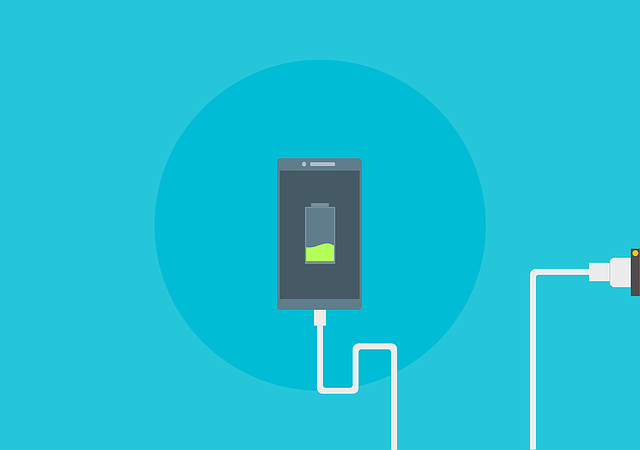
Creating fast loading mobile pages is paramount for delivering an exceptional user experience, especially considering the vast majority of internet traffic now comes from mobile devices. A key aspect of mobile-friendly design, optimized loading speeds should be achieved through a combination of strategies. Firstly, minimize the use of heavy media assets such as large images and videos, compressing them without sacrificing quality where possible. Secondly, leverage browser caching to reduce the need for repeated downloads of resources, enhancing page load times significantly.
Additionally, implementing a content delivery network (CDN) can further expedite loading by serving content from servers closer to users geographically, reducing latency. Efficient code optimization is also vital; minifying and combining CSS and JavaScript files, along with using asynchronous loading for scripts, ensures these resources are processed swiftly. Lastly, consider using lazy loading techniques for images and videos that only load when they enter the viewport, further contributing to faster page loads.
Optimizing Images and Media for Mobile Efficiency

In the pursuit of a seamless mobile-friendly design, optimizing images and media is paramount. With limited data plans and varying network speeds, users expect content to load swiftly on their mobile devices. To ensure this, it’s crucial to compress images without compromising quality significantly. Tools like Image Optimization plugins or manual resizing and format switching (from JPEG to WebP) can help reduce file sizes dramatically.
Further efficiency gains come from utilizing responsive image formats that adapt to the screen size of the device. This practice not only enhances loading times but also reduces data usage, improving the overall user experience. Remember, each millisecond counts in a mobile-first world, and optimizing media content is an integral step towards crafting a truly mobile-friendly design that captivates users from the get-go.
Tools and Technologies for Streamlining Mobile-Friendly Development

Creating a mobile-friendly design has become essential for businesses aiming to thrive in today’s digital landscape. Fortunately, developers have access to an array of tools and technologies that streamline this process. These include responsive design frameworks like Bootstrap and Foundation, which provide pre-built components and styles that adapt seamlessly to various screen sizes.
Additionally, CSS media queries enable dynamic layout adjustments based on device characteristics, ensuring optimal viewing experiences across smartphones, tablets, and desktops. JavaScript libraries such as jQuery Mobile offer enhanced interactivity and animation effects, making mobile interfaces more engaging. Furthermore, tools like Google’s Mobile-Friendly Test and Device Art help developers simulate real-world conditions, enabling them to identify and fix potential issues before launching their websites or apps.
Measuring Success: Key Metrics for Evaluating Mobile-Friendly Effectiveness
Measuring the success of a mobile-friendly design is crucial for understanding its effectiveness and impact on user experience. Key metrics play a vital role in evaluating how well a website or application adapts to various screen sizes and devices. One primary metric is the bounce rate, which indicates the percentage of visitors who leave your site after viewing only one page. A low bounce rate suggests that users are engaging with your content, while a high rate might signal issues with usability or relevance on mobile devices.
Another essential metric is session duration, representing the average time users spend on-site during their visit. Longer session durations often correlate with higher satisfaction and ease of navigation, especially on smaller screens. Additionally, tracking conversion rates specific to mobile users provides insights into how well your design supports desired actions, such as sign-ups or purchases, from mobile devices. These metrics collectively help identify areas for improvement in the mobile-friendly design process, ensuring a better user journey across all platforms.