
The latest web design trends prioritize minimalist aesthetics, responsive design, micro-interactions, dark mode, custom typography, interactive elements, isometric/3D designs, and sustainability. These trends simplify interfaces, enhance usability, improve accessibility, boost engagement, and cater to users' growing demands for visually appealing, intuitive, and eco-conscious digital experiences. Incorporating these innovations can set websites apart in a crowded online landscape.
Stay ahead of the curve with the latest web design trends shaping the digital landscape. From minimalist aesthetics simplifying user interfaces to responsive design adaptations for seamless cross-screen experiences, this article explores cutting-edge practices transforming online interactions. Discover the power of micro-interactions, dark mode’s growing appeal, and color psychology’s influence. Learn about custom typography, engaging interactive elements, and breaking dimensional barriers with isometric and 3D designs. Embrace sustainable web design practices for an eco-friendly future.
Minimalist Aesthetics: Simplifying Web Design
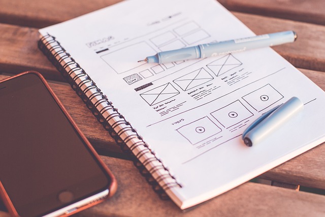
In the realm of the latest web design trends, Minimalist Aesthetics is making waves, simplifying and refining digital spaces. This approach prioritizes simplicity, clean lines, and a reduced color palette, creating a serene user experience. By stripping down complex elements, designers are able to focus on content, ensuring every feature serves a purpose. In today’s digital era, this trend not only enhances usability but also improves page load times, making websites more accessible and efficient.
Minimalist designs offer a calm and organized environment for users, allowing them to navigate effortlessly. This strategy is particularly effective for e-commerce sites, where a clutter-free interface can boost customer engagement and conversions. In terms of latest web design trends, Minimalism is not just a style; it’s a game changer that fosters better user interactions and improves overall website performance.
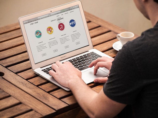
Responsive Design Evolution: Adapting to All Screens

The evolution of responsive design has been a significant aspect of the latest web design trends, ensuring websites adapt seamlessly to various screens and devices. This approach is no longer an option but a necessity in today’s digital landscape, where users access information from desktops, tablets, and smartphones. The initial days of responsive design involved using media queries and flexible layouts to adjust content, but modern techniques have taken this a step further.
Now, designers leverage advanced CSS technologies, such as grid layouts and flexbox, combined with JavaScript frameworks, to create dynamic and adaptable user interfaces. This not only enhances the visual appeal but also improves user experience by providing optimized viewing and interaction on every screen size. As devices continue to diversify, responsive design remains a cornerstone of web development, ensuring websites remain accessible, functional, and visually appealing across the board.
Micro-interactions: Adding Subtle User Experiences

In the realm of latest web design trends, micro-interactions have emerged as a powerful tool to enhance user experiences. These subtle animations and feedback mechanisms, though small in scale, can significantly impact how users interact with websites. By incorporating micro-interactions, designers can create engaging interfaces that provide immediate visual cues and acknowledge user actions, making the overall experience more intuitive and enjoyable.
From button hover effects to form validation messages, these tiny details contribute to a site’s responsiveness and personality. As users navigate through web pages, well-crafted micro-interactions keep them engaged, fostering a sense of satisfaction and building trust in the brand. In today’s digital era, where user attention is a precious commodity, focusing on these latest web design trends can set your website apart and create memorable interactions for your audience.
The Rise of Dark Mode and Color Psychology
The digital landscape is evolving, and so are our visual preferences. One of the most prominent trends in current web design is the embrace of Dark Mode, a design choice that shifts the color palette towards deeper tones. This trend isn’t just about aesthetics; it caters to user experience by reducing eye strain, especially in low-light environments. Studies show that dark backgrounds with light text can improve readability and enhance visual clarity, making it a popular pick for many designers.
Color psychology plays a significant role in this shift. Dark Mode leverages the calming effect of cooler tones, creating a more relaxed and sophisticated ambiance. In the context of latest web design trends, this trend is not just a passing fad but a thoughtful consideration of user well-being and engagement. Designers are using color to evoke specific emotions, making websites not just visually appealing but also strategically designed to captivate and retain users’ attention.
Custom Typography: Crafting Unique Identities
In the realm of latest web design trends, custom typography stands out as a powerful tool for crafting unique brand identities. Gone are the days when generic fonts sufficed; modern websites now embrace the individuality that comes with tailored typefaces. This trend not only enhances visual appeal but also strengthens a website’s ability to communicate its essence effectively. By selecting or creating specific fonts, designers can convey the tone and personality of a brand, making each site truly distinct.
Custom typography adds depth and sophistication to web design, allowing for more expressive and memorable user experiences. It enables designers to integrate seamlessly with other design elements, such as color schemes and layout structures, to create harmonious and engaging interfaces. As we navigate the ever-evolving landscape of latest web design trends, custom typography remains a game-changer, ensuring that brands can communicate their unique stories in ways that resonate deeply with their audiences.
Interactive Elements: Engaging Users Beyond Buttons

In the realm of latest web design trends, interactive elements are evolving beyond simple buttons and links to become central components that engage users in dynamic ways. Designers are leveraging emerging technologies to create immersive experiences, such as hover effects that trigger 3D animations or micro-interactions that provide instant visual feedback. These innovative approaches not only enhance user engagement but also foster a deeper connection with the website’s content.
By incorporating interactive elements like drag-and-drop functionalities, parallax scrolling, and dynamic forms, web designers are making their creations more captivating and intuitive. Such trends not only cater to users’ desire for interactivity but also align with today’s fast-paced digital landscape, where instant gratification is paramount. As these latest web design trends continue to evolve, so does the bar for user experiences, pushing designers to innovate and create visually stunning and interactive websites that keep visitors engaged and returning for more.
Isometric and 3D Web Design: Breaking Dimensional Barriers

In the realm of latest web design trends, isometric and 3D designs are challenging conventional two-dimensional aesthetics. This innovative approach breaks dimensional barriers, offering users immersive experiences that go beyond traditional flat interfaces. By leveraging advanced technologies, designers can now create visually stunning and interactive spaces that appear to pop off the screen.
Such designs add depth and dimension to websites, making them more engaging and captivating. Whether it’s showcasing products in a 3D environment or presenting information in an isometric perspective, this trend enhances user interactions and improves overall visual appeal. As web design continues to evolve, embracing these latest trends can help businesses stand out in a crowded digital landscape.
Sustainable and Eco-Friendly Web Design Practices
In the realm of latest web design trends, sustainability and eco-friendly practices are emerging as a powerful force. Designers are increasingly recognizing the impact of their craft on the environment, leading to innovative approaches that reduce digital footprints. One key trend is the adoption of renewable energy sources for hosting websites, ensuring that online presence contributes positively to global conservation efforts.
Visual elements also play a crucial role in this shift. Developers are integrating natural motifs and organic textures into web interfaces, creating visually appealing designs that resonate with users while promoting environmental consciousness. Additionally, the implementation of responsive design techniques allows for optimized resource usage, minimizing energy consumption and waste. These sustainable practices not only benefit the planet but also cater to modern audiences who appreciate responsible digital solutions, further solidifying their place among the latest web design trends.