
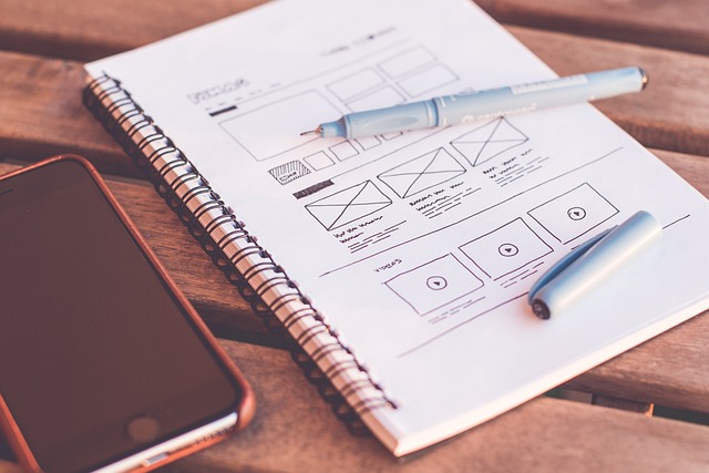
Web design focuses on User Experience (UX), creating intuitive digital environments that cater to user goals and behavior. An effective web design incorporates clean navigation, responsive layouts for all devices, strategic visual hierarchy, balanced aesthetics, and optimized loading times. Responsive design ensures seamless experiences across platforms, while visual hierarchy guides users through content logically. White space and negative space are crucial for enhancing aesthetics and guiding user attention. By prioritizing user needs, designers create engaging, efficient, and memorable online experiences that drive satisfaction and repeat visits.
In today’s digital landscape, effective website layout design is paramount for capturing user attention and driving engagement. A well-designed site not only enhances user experience (UX) but also improves conversion rates. This article delves into the crucial aspects of web design, including understanding UX, arranging content through visual hierarchy, adapting to diverse screens with responsive design, optimizing navigation, and leveraging white space. By exploring these key elements, you’ll gain insights to create compelling and user-friendly websites.
Understanding User Experience and Its Role in Web Design
In the realm of web design, User Experience (UX) is a cornerstone that transcends mere aesthetics. It’s about creating digital environments intuitive and engaging, ensuring visitors can effortlessly achieve their goals. A well-designed UX considers every interaction, from loading times to navigation ease, shaping how users perceive and engage with a website. By prioritizing user needs, web designers foster a sense of satisfaction and encourage repeat visits, thereby enhancing the overall effectiveness of any online presence.
UX isn’t just about aesthetics; it’s the bridge between a website’s visual appeal and its practical utility. Effective UX design involves understanding user behavior, conducting thorough research, and employing data-driven insights to inform layout decisions. This holistic approach ensures that the website not only looks good but also functions seamlessly, providing users with a positive, efficient, and memorable experience—a key differentiator in the competitive world of web design.
Key Elements of Effective Website Layout Design

Effective website layout design hinges on incorporating key elements that enhance user experience and drive engagement. Firstly, a clean and intuitive navigation system is vital. This includes clear menus, search bars, and breadcrumbs that allow users to easily explore and find content. Secondly, responsive design is essential, ensuring the website adapts seamlessly across various devices and screen sizes, from desktops to mobile phones.
Visual hierarchy plays a significant role too. Through strategic use of spacing, typography, and color, designers can guide users’ attention towards important elements like calls-to-action (CTAs) and featured content. Balancing aesthetics with functionality is crucial; an appealing design that is also easy to navigate fosters higher user satisfaction and encourages visitors to explore further. Additionally, optimal page load times are achieved through efficient coding practices and optimized media, ensuring a seamless browsing experience.
Visual Hierarchy: Arranging Content for Maximum Impact

In effective web design, Visual Hierarchy is a powerful tool that guides users through a website’s content, ensuring they have a seamless and engaging experience. It involves arranging elements on a page—from headings to images to calls-to-action—in a way that reflects their importance and draws the user’s eye naturally. By establishing a clear hierarchy, designers can make crucial decisions about spacing, size, and placement, allowing essential information to stand out while less critical details remain subtle in the background.
This strategic arrangement helps users process information quickly and efficiently. For instance, larger, bolder headings at the top of a page immediately convey the main topics, while subheadings and body text provide supporting details. Visual hierarchy also facilitates navigation by suggesting a logical flow from one section to another, enhancing user engagement and interaction with the website. In web design, understanding and implementing visual hierarchy is key to creating sites that are not only aesthetically pleasing but also highly functional and user-friendly.
Responsive Design: Adapting to Various Screens and Devices

In the realm of web design, responsive design is a game-changer that ensures websites adapt seamlessly to various screens and devices. This approach is crucial for creating an optimal user experience across desktops, tablets, and smartphones. By employing flexible layouts, fluid grids, and media queries, designers can make sure that every element on a page rearranges itself beautifully, regardless of the display size or orientation.
Responsive web design isn’t just about making a website look good on different devices; it’s also about enhancing functionality and performance. It means optimizing content for touch interactions, ensuring fast loading times, and providing clear navigation even on smaller screens. This versatility is essential in today’s digital era where users access the internet from countless gadgets, making it a fundamental aspect of modern web design that all professionals should consider.
Best Practices for Navigation and Site Structure
In effective web design, navigation is key. A well-structured site should offer users a seamless and intuitive journey through its pages. Best practices involve creating a clear hierarchy with a prominent main menu that categorizes content logically. This allows visitors to easily explore different sections and find what they’re looking for without confusion or frustration.
Site structure should be hierarchical, reflecting the organization’s goals and user needs. Using breadcrumbs and internal linking enhances navigation further, helping users understand their current location within the site and providing alternative paths to key information. Keep pages uncluttered and focus on delivering content in a way that supports smooth user interaction, ultimately enhancing the overall web design experience.
Using White Space and Negative Space for Enhanced Aesthetics

In web design, white space and negative space are powerful tools that often get overlooked yet significantly contribute to a website’s aesthetics and usability. White space refers to the areas between content elements on a page, while negative space is the empty area around objects or text. Utilizing these spaces effectively can dramatically enhance the visual appeal of a website.
By strategically placing white space, designers can guide users’ eyes naturally through the page, creating a sense of balance and order. This technique also helps to prevent clutter, making it easier for visitors to scan and digest information. Negative space, on the other hand, allows certain elements to stand out, adding emphasis and depth to the design. In web design, this can be particularly useful for highlighting key calls-to-action or showcasing important visuals, ensuring they capture users’ attention instantly.