
Responsive Web Design (RWD) is a modern approach ensuring websites adapt seamlessly across devices, providing optimal user experiences. Its benefits include improved accessibility, enhanced SEO rankings, and cost savings for businesses. Small businesses can implement RWD affordably using open-source frameworks, pre-designed templates, and cloud services. Key principles involve flexible layouts, content prioritization, and leveraging existing CSS frameworks. Free platforms like WordPress and Wix simplify the process for non-coders. Successful case studies prove that budget-friendly RWD solutions deliver high-quality experiences. The future of RWD includes advancements in accessibility, performance, AI integration, and voice search optimization.
In today’s digital landscape, ensuring your website adapts seamlessly across diverse devices is paramount. Responsive Web Design (RWD) offers a dynamic approach, enhancing user experience regardless of screen size. This article guides you through the essentials of RWD, highlighting its advantages and addressing the challenges of implementing affordable solutions. We’ll explore key principles, beneficial tools, inspiring case studies, and future trends, empowering you to create cost-effective, responsive websites that captivate users globally.
Understanding Responsive Web Design: The Basics
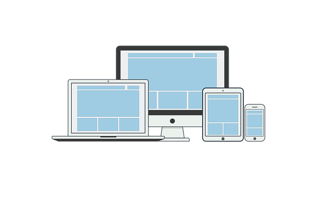
Responsive Web Design, a fundamental concept in modern web development, is the approach that ensures websites adapt and display optimally on various devices and screen sizes. This design philosophy has become essential as users access the internet through desktops, tablets, and smartphones in equal measure. The key idea behind Responsive Web Design (RWD) lies in its flexibility, where layouts adjust fluidly based on the available space, ensuring a seamless user experience regardless of the device used.
At its core, RWD utilizes flexible grids, flexible images, and cascading style sheet media queries to achieve this responsiveness. Flexible grids allow content to rearrange itself, while flexible images resize proportionally, filling the available space without distorting. Media queries, a powerful tool in CSS, enable developers to apply specific styles based on device characteristics, such as screen width or orientation, further enhancing the adaptability of web pages.
Benefits of Implementing Responsive Design

Implementing Responsive Web Design (RWD) offers a multitude of benefits for businesses and website owners, making it an indispensable approach in today’s digital landscape. One of its key advantages is enhanced user experience; RWD ensures that websites adapt seamlessly to various devices and screen sizes, providing a consistent and optimized viewing experience on desktops, tablets, and smartphones. This adaptability not only caters to the growing number of mobile users but also improves accessibility, making your site inclusive for all.
Additionally, responsive design significantly boosts search engine optimization (SEO). Search engines favor websites that offer a great user experience across different platforms, and RWD aligns perfectly with this criteria. By having one flexible design that accommodates all screen sizes, you avoid the need for separate site versions, simplifying website management and reducing development costs. This strategy also helps in improving your site’s ranking on search engine results pages (SERPs), making it easier for potential customers to find your business online.
Challenges and Solutions in Creating Affordable Responsive Designs

Creating affordable responsive designs presents a unique set of challenges, especially for small businesses and startups with limited budgets. One of the primary hurdles is the cost associated with developing and maintaining a website that adapts seamlessly across various devices and screen sizes. Responsive Web Design (RWD), which aims to provide an optimal user experience regardless of the device used, often requires advanced coding skills and specialized tools, adding to the financial burden.
However, several innovative solutions have emerged to address these challenges. Open-source frameworks like Bootstrap and Foundation offer cost-effective ways to implement RWD with minimal coding knowledge. Additionally, pre-designed templates and themes from reputable sources can significantly reduce development time and costs. Cloud-based hosting services also play a crucial role by providing scalable and affordable infrastructure for responsive websites. These strategies empower businesses to deliver high-quality, user-friendly experiences without breaking the bank.
Key Principles for Cost-Effective Responsive Layouts

Implementing Responsive Web Design (RWD) on a budget is achievable by adhering to some key principles. Firstly, use flexible grid systems and media queries to ensure your layout adapts gracefully across devices. This approach allows for dynamic content positioning, making the design responsive without breaking the bank. Secondly, prioritize content over style. By focusing on structural HTML and CSS that adapt to different screen sizes, you can reduce the need for complex and costly custom solutions.
Additionally, leverage existing CSS frameworks like Bootstrap or Tailwind CSS, which offer a range of pre-designed components and utilities optimized for responsiveness. These tools provide a solid foundation for RWD, enabling developers to build affordable and visually appealing websites that adapt seamlessly to various devices without sacrificing performance or user experience.
Tools and Resources for Building Responsive Websites on a Budget
Building a responsive website doesn’t have to break the bank. There are numerous tools and resources available that cater specifically to budget-conscious creators. Free or low-cost platforms like WordPress, Wix, and Squarespace offer intuitive drag-and-drop builders with responsive design features built-in. These options allow for quick website creation without requiring extensive coding knowledge.
For developers seeking more customization, open-source frameworks like Bootstrap and Foundation provide a solid foundation for responsive design. These tools offer a wealth of pre-designed components and layouts that can be easily adapted to create visually appealing and mobile-friendly websites. Additionally, free image and icon libraries, such as Unsplash and Flaticon, help keep costs low by providing high-quality media assets without licensing fees.
Case Studies: Successful Affordable Responsive Design Projects

In the realm of Responsive Web Design, numerous case studies highlight successful projects that demonstrate affordable yet impactful solutions. One standout example is a non-profit organization’s website overhaul, where a limited budget was transformed into a powerful online presence. Through strategic planning and creative coding, developers crafted a design that seamlessly adapted across various devices, from desktops to smartphones, ensuring an optimal user experience for all. This project not only increased accessibility but also saw a substantial rise in engagement, proving that responsive design need not be cost-prohibitive.
Another inspiring case involves a small business owner who, with the help of innovative design strategies, launched an e-commerce site that rivaled industry giants. By prioritizing mobile users and employing smart layouts and media queries, the website offered a fast, intuitive shopping experience. This approach not only attracted local customers but also expanded their reach globally, showcasing how responsive design can be a game-changer for businesses of all sizes, providing them with a competitive edge in today’s digital landscape.
Future Trends in Affordable Responsive Web Development

As we move forward, the landscape of web development is constantly evolving, and Responsive Web Design (RWD) remains at the forefront of these changes. Future trends suggest that affordable RWD will become even more sophisticated, with enhanced focus on accessibility and performance. Developers are likely to adopt new technologies like WebAssembly and improved CSS frameworks to create faster loading, highly interactive websites that adapt seamlessly across all devices.
Artificial Intelligence (AI) and Machine Learning (ML) integration in RWD is another emerging area. These technologies can predict user behavior and optimize content delivery, resulting in more personalized and efficient user experiences. Additionally, voice search optimization will gain prominence, aligning with the growing use of virtual assistants, requiring developers to implement structured data markup and optimize content for voice queries.