
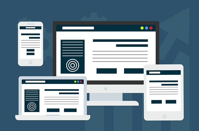
Responsive Web Design (RWD) is a modern web development approach ensuring websites adapt seamlessly to various screen sizes and devices. Using techniques like media queries, fluid grids, and flexible images, developers create layouts that adjust proportionally, maintain readable content, and serve device-specific CSS styles. Key principles include flexibility with relative units, interactivity through media queries, optimizing content for visual appeal and functionality across all platforms. Implementing RWD leads to better user experience, increased retention, and improved conversion rates. Tools like Bootstrap, JavaScript libraries, and modern development environments streamline the process. Best practices in RWD evolve with technology, focusing on voice interfaces, AR, and AI personalization to enhance accessibility and engagement.
In today’s digital landscape, a seamless user experience across various devices is paramount. Adaptive Web Design, a branch of Responsive Web Design (RWD), rises as a game-changer. This article delves into the fundamentals of RWD, exploring key principles and techniques for crafting flexible, user-centric designs. We’ll discuss crucial UX considerations, examine powerful tools and technologies, and review best practices while peering into emerging trends shaping the future of responsive development.
Understanding Responsive Web Design: The Basics
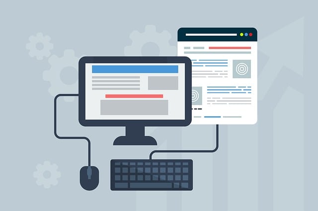
Responsive Web Design is a fundamental concept in modern web development, ensuring websites adapt seamlessly to various screen sizes and devices. It involves creating flexible layouts, images, and CSS styles that can reconfigure themselves based on the user’s environment, be it a desktop computer, tablet, or smartphone. This approach is crucial for providing an optimal user experience across different platforms.
At its core, Responsive Web Design focuses on using media queries, fluid grids, and flexible images to achieve this adaptability. Media queries allow developers to serve specific CSS styles based on device characteristics like screen width and resolution. Fluid grids create layouts that adjust proportionally, ensuring content remains readable and accessible regardless of the display size. Flexible images resize themselves while maintaining their aspect ratios, preventing unwanted stretching or cropping.
Key Principles of Adaptive Layouts

The key principles of adaptive layouts, or Responsive Web Design, revolve around creating flexible and dynamic web pages that seamlessly adjust to various screen sizes and devices. This approach ensures a consistent user experience across different platforms, from desktops to tablets to smartphones. The first principle is flexibility, where designs use relative units like percentages instead of fixed pixels, allowing elements to rescale gracefully based on the available space.
Interactivity and media queries are other vital aspects. Media queries enable developers to apply specific CSS styles based on device characteristics, such as screen width or orientation. This allows for content to be optimized for each device, ensuring not only visual appeal but also easy navigation and functionality. By integrating these principles, web designers can create adaptive layouts that provide a rich, accessible, and visually satisfying experience for all users, regardless of the hardware they’re using.
Techniques for Creating Flexible Designs
Creating flexible and adaptive designs is the cornerstone of responsive web design. The key techniques involve using a grid system that adapts to different screen sizes, ensuring content remains readable and accessible. Flexbox and CSS Grid Layout are powerful tools for achieving this; they allow developers to define relationships between elements and easily resize them based on available space. By setting up media queries with specific breakpoints, the layout can transform gracefully across devices, from desktops to tablets and mobile phones. This approach ensures a seamless user experience, regardless of the screen size or orientation.
Additionally, utilizing relative units like percentages and ems for widths and font sizes enables designs to scale proportionally. This flexibility is crucial for maintaining visual hierarchy and ensuring critical elements remain prominent. Images and media should also be optimized with appropriate formats and sizes to prevent slow loading times and preserve performance, especially on smaller screens. These combined strategies form the backbone of an effective responsive web design strategy.
User Experience Considerations

When implementing Adaptive Web Design, focusing on user experience (UX) considerations is paramount. A key aspect of this is ensuring your site adapts seamlessly to various devices and screen sizes, thanks to Responsive Web Design techniques. This not only means that users across smartphones, tablets, and desktops enjoy a consistent layout and functionality but also that critical content remains easily accessible and legible regardless of the platform.
UX also encompasses usability, accessibility, and user satisfaction. Adaptive design should streamline navigation, allowing visitors to effortlessly find what they need. Moreover, it must cater to diverse user needs by providing options for text size adjustments, keyboard navigation, and other accessibility features that enhance inclusivity. Ultimately, a well-executed adaptive design strategy translates into higher user retention, improved conversion rates, and better overall satisfaction.
Tools and Technologies for Responsive Development

In the realm of Responsive Web Design, developers have at their disposal a plethora of tools and technologies that streamline the process of creating adaptive websites. One of the most popular and powerful tools is Bootstrap, a CSS framework that provides a robust set of pre-designed components and layouts, enabling developers to quickly build responsive designs with minimal coding effort. Additionally, JavaScript libraries like jQuery make dynamic content manipulation easier, enhancing user interactions on different devices.
Other notable technologies include CSS media queries, which allow for server-side rendering and efficient detection of device characteristics, ensuring optimal display across a wide range of screens. Furthermore, modern development environments like Visual Studio Code offer enhanced editing and debugging capabilities, making responsive development more accessible and efficient. These tools collectively contribute to the rapid creation of adaptive websites that cater to users across diverse platforms, thereby enhancing overall user experience.
Best Practices and Future Trends

In the realm of Adaptive Web Design, best practices continue to evolve alongside future trends, driven by an ever-changing digital landscape. One key practice remains paramount: Responsive Web Design (RWD). RWD ensures websites seamlessly adapt to various screen sizes and devices, providing users with an optimal experience regardless of their technology. This involves utilizing flexible layouts, images, and CSS media queries to adjust content for both desktop and mobile platforms.
Looking ahead, trends suggest an increased focus on voice user interfaces, immersive experiences through augmented reality (AR), and personalized design based on artificial intelligence (AI). These innovations aim to further enhance accessibility and engagement by tailoring content to individual preferences. As technology advances, designers will need to embrace these shifts, ensuring their Adaptive Web Designs remain cutting-edge and user-centric.